| Image |
Comment |
| 02/02/2006 09:46:25 AM |
|
 Photographer found comment helpful. Photographer found comment helpful. |
| 02/02/2006 08:43:07 AM |
Blue Belleby gwendyComment by dprincipe: I like very much this shot. I think there's a little problem with exposition. There is too much light on the face of the girl.
But... how wondeful are her eyes?!?!?!??
Regards,
J. |
| Photographer found comment helpful. |
| 02/02/2006 08:19:46 AM |
Blue Belleby gwendyComment by AlexSaberi: nice idea. for me there needs to be more sharpness . Particularily on the eyes. Could be fixed with better processing poss? good luck |
| Photographer found comment helpful. |
| 02/01/2006 05:53:51 PM |
Blue Belleby gwendyComment by saphire: beautiful picture, beautiful colors. I think it could be cropped a little closer on the right, but it's lovely as it is |
| Photographer found comment helpful. |
| 02/01/2006 01:28:41 PM |
Blue Belleby gwendyComment by DrAchoo: I hate it when a) there is a picture nearly identical to mine and b) it's better. Nice capture of her eyes. I couldn't quite get mine to stand out. 8 |
| Photographer found comment helpful. |
| 02/01/2006 05:32:21 AM |
|
| Photographer found comment helpful. |
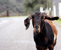
| 11/03/2005 09:47:31 PM |
Nakedby gwendyComment by Neuferland: Greetings from the Critique Club!
First I have to say, awwwwwwwwwwwwwwww! So cute! I love animal shots so I'm probably not the best person to critique this. But here goes.
First, great overall shot, really well done, the contrast just jumps out at you and catches your attention. Second, the addition of the grain really adds to this shot to a point, I think you could have gotten away with a bit more so it showed up on the bird itself. The lack of grain in that area probably hurt your overall score. That and the lack of black in the shot, I see the white and lots of grays but nothing really black to really make the shot pop.
The lighting is really well done and I like how the face seems to be in just a bit of a shadow, very nice. And the use of negative space on the right really works for me, I love these kinds of shots. A nice use of the rule of thirds though the upper left intersection doesn't land on anything in particular the lines run through the eyes and head drawing you in.
Overall, bravo!!!
Hope my comments help and Good luck in future Challenges!
Deannda |
| Photographer found comment helpful. |
| 10/30/2005 08:05:01 AM |
Nakedby gwendyComment by tate: wow that's nifty! looks like a nice guy to hang out with! 7 |
| Photographer found comment helpful. |
| 10/29/2005 09:49:24 PM |
|
| Photographer found comment helpful. |
| 10/29/2005 03:40:05 PM |
Nakedby gwendyComment by magnus: Fabulous photo! The grain is neither here nor there, but I'm not going to take any points for that. The lighting is just great and the shallow DOF works very well. The simple composition works too, although I wander if including the whole crest would have been even better. 9 |
| Photographer found comment helpful. |
Home -
Challenges -
Community -
League -
Photos -
Cameras -
Lenses -
Learn -
Help -
Terms of Use -
Privacy -
Top ^
DPChallenge, and website content and design, Copyright © 2001-2026 Challenging Technologies, LLC.
All digital photo copyrights belong to the photographers and may not be used without permission.
Current Server Time: 07/09/2026 05:20:16 PM EDT.