| Image |
Comment |
| 03/11/2006 06:04:33 PM |
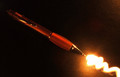
Lightning Penby clypComment by TooCool: From the Critique Club:
Your lack of photographers comments does not help to tell me what you were trying to achieve with this shot. This makes it a bit tougher to do an in depth critique but let's see what we can come up with anyways...
The overall concept of this shot is very sound! I like how you have a nice diaginal line running through the shot. You did a nice job of lining up the 'writing' with the pen. It actuall does appear to be coming out of the pen tip. You also have nice colors and a good overall color scheme!
The lighting on the pen itself however is a little confusing. It appears on the top half of the pen to be coming from one place. On the part of the pen you actually hold on to it's coming from all around. On the tip of the pen it appears to be coming from a different angle. The total effect of this is confusing to the eye. Another thing that is a bit confusing to the eye is that even though you have light seeming to come from different angles, the overall look of the shot is very flat. Was the light that you used to create the 'writing' the only light in the shot?
The pen itself also does not seem to be truly in focus. It doesn't look like soft focus, it actually looks OOF. This doesn't go over very well with the voters here.
What could improve the shot? Having never tried this type of shot I'm not sure. I know that I would really like to see it brightened up a bit and I would like to see the pen sharper. I think that these two improvements alone would have taken this from a nice shot to one that stood out of the crowd.
Yours
TC |
 Photographer found comment helpful. Photographer found comment helpful. |
| 03/05/2006 05:47:24 PM |
|
| Photographer found comment helpful. |
| 03/05/2006 10:09:23 AM |
|
| Photographer found comment helpful. |
| 03/03/2006 09:11:37 PM |
|
| Photographer found comment helpful. |
| 03/03/2006 08:51:31 AM |
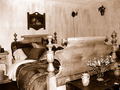
Old Bed Roomby clypComment by e301: from the outer edge of the Critique Club
Good toning here, which is a fine start to this challenge. You haven't gone for the blatantly gooey sepia, but something a little harder, a little less blatantly warm, which is effective. my problems with this image lie, as a couple of people mentioned in comments, with the lighting and composition.
The direct on-camera flash has left you with some very very harsh light to deal with - the very bright near bed-post, the brightness of the wall, the very ugly shadows of the near bed-head too. Coupled with the brightness thing, your placing of that near post in frame makes it arguably the strongest element of the photograph, the thing the eye is first drawn to: but the flat light from the flash allows no shading of that object to give it any sense of depth and thus kills any interest it might hold for the eye. Compositionally, that post also obscures what one might think would be the 'natural' point of interest in the shot - the head of the bed - and that makes for an uncomfortable picture. Detail and difinition are fine, but it's you lighting that you most need to work on on this evidence. A good first rule is always to light from the side - get a remote flash, get a tripod and use natural light, but direct on-camera flash will always produce that flattening effect, and is rarely useful - especially in still life photography. |
| 03/01/2006 11:45:29 PM |
Lightning Penby clypComment by ALA: A little more detail on the pen would have been nice, but overall a nice picture and interesting idea. |
| Photographer found comment helpful. |
| 02/28/2006 04:50:16 AM |
Old Bed Roomby clypComment by erling: Looks like something I'd have expected from real estate advertisements in the late 1800's ;) |
| Photographer found comment helpful. |
| 02/25/2006 11:19:24 PM |
|
| Photographer found comment helpful. |
| 02/25/2006 05:29:51 AM |
Old Bed Roomby clypComment by wrobel: Eye wandering all over the place, nothing to focus on. Ya gotta have a subject. 4 |
| Photographer found comment helpful. |
| 02/23/2006 12:26:53 AM |
Old Bed Roomby clypComment by Evaan: I like this capture. It feels like it should be Miss Kitty's room! The toning did a great job of making it look old. Like the perspective. 7 |
| Photographer found comment helpful. |
Home -
Challenges -
Community -
League -
Photos -
Cameras -
Lenses -
Learn -
Help -
Terms of Use -
Privacy -
Top ^
DPChallenge, and website content and design, Copyright © 2001-2026 Challenging Technologies, LLC.
All digital photo copyrights belong to the photographers and may not be used without permission.
Current Server Time: 07/02/2026 08:22:42 PM EDT.