What I Seeby
arnitComment by HBunch: *Critique Club*
Strange that I got "Purple" also as a CC assignment.
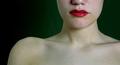
I think I had suggested cropping the face in that shot, but I think in this one I'd like to see MORE of the face actually. Right in the middle of her head seems like a strange place for a crop. Especially when showing so much of the shoulders. While her shoulders may be pretty, I don't think they really need to be in this photo to work with the challenge. The white actually takes up more space than the green, which is suposed to be the main thing for the challenge. So, I think for this shot, I would show more head, less shoulders.
Focus and clarity are again really good. We can see the little creases in her lips. Great detail you show us here.
The lighting is good as well. No distracting hot spots or annoying shadows.
Again, I like how you have positioned her to the right of the photo, however, I think that I'd like the negative space to be more green for the purpose of the challenge. Outside the challenge, I think the background works very well.
I think that there is a great deal of white between the red and green, and I think that makes it seem like the shot isn't quite focused on the colors. Maybe making the green area of the background larger, and creating less skin would help to put the visual focus on the color and not nessisarily just the girl.
As for your poem, I'm not really sure I get it. But this line "Believe in me though u cannot c what lies within the Dark " Kind of makes me think that you were trying to make us look really hard for the green, which is partially hidden in the darkness. Maybe even TOO hidden.
~Heather~