| Image |
Comment |
| 06/21/2003 01:09:43 PM |
|
| 06/21/2003 08:37:16 AM |
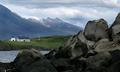
Come Away With Meby arnitComment by adine: There is a sense of discovery in the "off-center-ness" of your composition - the diagonals of rock and mountain criss-crossing and the building almost unexpected on the side. You've got to love Iceland! One picky ting- wish you could have had the lake not cut in two by the rock - bottom left - just got the camera up a bit higher. |
| 06/21/2003 12:24:21 AM |
|
| 06/20/2003 11:49:08 PM |
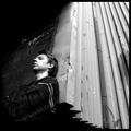
My Weaknessby arnitComment by ozdick: Would have preferred for a self portrait, for you to take up a bit more of the image, but apart from that, this pic is hard to fault, the composition lighting and angle all work extremely well. It's the kind of shot you would see on an artists CD album cover and as such I find this works really well. |
| 06/20/2003 01:52:53 PM |
Come Away With Meby arnitComment by Shadow Eagle: Love the picture. Makes me wish i was there . Only distracting area is the water below flagpole. The lighting is beautiful 8 |
| 06/20/2003 01:17:00 PM |
Life is too Shortby arnitComment by eloise: Far too much 'bright, normally exposed' subject for my tastes in this challenge, I'm afraid. If it were, say, sidelit dramatically so the smoke showed and the cigarette and ashtray were more suggested than shown, quite possibly a 9 or 10 for me. As-is, though, 5. |
| 06/20/2003 11:24:20 AM |
Vogueby arnitComment by Sonifo: The only thing that bugs me about this photo is the lipstick color. I would rather see a lighter color or a red, definitly not pink. She is very beautiful. |
| 06/20/2003 11:01:35 AM |
Life is too Shortby arnitComment by mci: this is really nice, but there's a couple of things that bother me. one, i think, is the shallow depth of field. i'm usually a big fan of this technique, but i think it looks a little odd with the glass ashtray and the cigarette. the sharply focused end of the cigarette and the very nicely lit and focused smoke trail are really great parts of this image, though.
maybe if you move the subject to the opposite side of the frame, the blur wouldn't bother me as much. i think right now it's kidn of blurring off into a hard edge of the photograph, whereas if it were on the other side it would blur off into the blackness of the background. anyway, overall a very nice effort. 7. |
| 06/20/2003 08:59:41 AM |
My Weaknessby arnitComment by jonpink: great shot man. fantastic -have my first 10 vote.
Ps: u look similar to Ewan Mcgreggor!
Cheers. Jon
|
| 06/20/2003 12:28:42 AM |
|
Home -
Challenges -
Community -
League -
Photos -
Cameras -
Lenses -
Learn -
Help -
Terms of Use -
Privacy -
Top ^
DPChallenge, and website content and design, Copyright © 2001-2026 Challenging Technologies, LLC.
All digital photo copyrights belong to the photographers and may not be used without permission.
Current Server Time: 04/10/2026 05:34:43 PM EDT.