| Image |
Comment |
| 05/01/2005 04:15:20 PM |
|
 Photographer found comment helpful. Photographer found comment helpful. |
| 05/01/2005 03:17:06 PM |
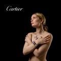
Defining Beautyby arnitComment by kearock: Concept is ok, but I think it would work better if you focused on one piece of jewelry. There's a little too much going on here. |
| 04/30/2005 10:09:33 PM |
|
| Photographer found comment helpful. |
| 04/30/2005 07:42:10 PM |
Defining Beautyby arnitComment by wewillexplore: Excellent image - I'm not very fond of the shadows - I'd prefer a flash/bounce flash under her arms/body a little more than here. Great idea tho! |
| Photographer found comment helpful. |
| 04/30/2005 02:08:40 PM |
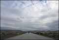
Reaching Nowhereby arnitComment by msdoubletrouble: this reminds me of another picure with father and child walking down/up the railroad tracks...i love perspective shot like this...VERY awesome...10 |
| Photographer found comment helpful. |
| 04/30/2005 01:56:47 PM |
Defining Beautyby arnitComment by Catherine_B: too much model not enough focus on the jewelry, the subject of the challenge. Too bad because these look like interesting pieces |
| 04/30/2005 04:34:02 AM |
Reaching Nowhereby arnitComment by taterbug: I really like your composition here. A very nice choice. Wonderful use of a vanishing point. The eye is lead very nicely to your subject. Dead spot on for this challenge IMO, and a photo that stands on it's own outside the challenge also. My only put off at all, and it is very slight, is it seems just a touch too dark. As I say, only slight, perhaps that is your intent to set the mood. I'm wondering if just a tad boost with maybe brightness or levels or curves would be a minor improvement? Maybe not, I still really like the shot. Nice work. |
| Photographer found comment helpful. |
| 04/30/2005 03:13:05 AM |
Defining Beautyby arnitComment by Bear_Music: Beautifully lit. I'd have toned down the white of the type to something more in balance with the overall tone, and used a little less negative sapce, both type and subject seem a bit lost in all that black. Of course, if there were more copy being applied, the black sapce might integrate better... |
| 04/30/2005 02:55:07 AM |
|
| 04/29/2005 11:32:05 PM |
Defining Beautyby arnitComment by mycelium: hi, arnit. *wink*
great job matching the font used in cartier's logo. though the placement looks rather arbitrary to me. |
| Photographer found comment helpful. |
Home -
Challenges -
Community -
League -
Photos -
Cameras -
Lenses -
Learn -
Help -
Terms of Use -
Privacy -
Top ^
DPChallenge, and website content and design, Copyright © 2001-2026 Challenging Technologies, LLC.
All digital photo copyrights belong to the photographers and may not be used without permission.
Current Server Time: 07/27/2026 09:47:40 AM EDT.