| Image |
Comment |
| 01/16/2003 04:52:58 AM |
|
 Photographer found comment helpful. Photographer found comment helpful. |
| 01/15/2003 09:18:28 PM |
|
| Photographer found comment helpful. |
| 01/15/2003 02:39:48 AM |
|
| Photographer found comment helpful. |
| 01/15/2003 02:36:23 AM |
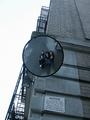
me & my friends (by the red hot chili peppers)by johnny_justjohnnyComment by Alecia: CC
This is such a great idea for this shot! I am immediately drawn to the lines and framing of this photo. I love the angle of the building and the contrasting circle created by the miror. the only thing i might have done differently in the composition is to crop out the bottom part of the building to not only get rid of the sign (which is kinda funny in a big-brother kind of way!) but to knock the mirror off center. i say that because the mirror is such a neat part of this photo--it has its own frame and everything--it just seems like it should be made to stand out a little more. the angle of the building behind creates an awesome backdrop, tho. technically it looks fine to me--no complaints here! i find myself wondering tho, how it would look if you did all the cropping things i mentioned, then converted to black and white with the levels jacked a bit? (you already have some cool contrast in the sky)
just me being curious really--i just think that this photo has all the cool angles and lines that make B&W photography so cool!
all in all, this is a great photo--very nice work!
|
| Photographer found comment helpful. |
| 01/14/2003 09:48:48 PM |
|
| Photographer found comment helpful. |
| 01/14/2003 09:11:20 PM |
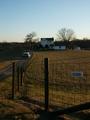
stimson_10000by johnny_justjohnnyComment by Lustre: This seems to be taken late in the day. Unfortunately I find it a little too dark to look at easily - especially around the house. Focus is very good, and it works as a portrait orientation. Composition is also good. I wonder if there is enough detail in the original image to lighten it slightly? |
| Photographer found comment helpful. |
| 01/14/2003 03:49:29 AM |
|
| Photographer found comment helpful. |
| 01/13/2003 03:03:30 PM |
stimson_10000by johnny_justjohnnyComment by karmat: I think if you had framed it slightly more to the left, so that the road went from the bottom of the frame into the picture, and the house was more to the right, it would seem more balanced, in my opinion. |
| Photographer found comment helpful. |
| 01/13/2003 04:57:50 AM |
|
| Photographer found comment helpful. |
| 01/12/2003 11:52:15 PM |
|
| Photographer found comment helpful. |
Home -
Challenges -
Community -
League -
Photos -
Cameras -
Lenses -
Learn -
Help -
Terms of Use -
Privacy -
Top ^
DPChallenge, and website content and design, Copyright © 2001-2026 Challenging Technologies, LLC.
All digital photo copyrights belong to the photographers and may not be used without permission.
Current Server Time: 06/10/2026 11:00:54 PM EDT.