| Image |
Comment |
| 12/27/2008 11:41:36 PM |
|
| 12/27/2008 04:49:53 PM |
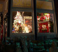
Timeby figmentComment by Ja-9: would have preferred this without the angles and other "stuff"...the window only would have been really good.... |
| 12/27/2008 02:31:38 PM |
Timeby figmentComment by bvy: Good idea, but there's too much to look at. Focusing just on the window would have been plenty. |
| 12/26/2008 06:29:36 PM |
Timeby figmentComment by Rino63: the image seems weak, there isn't an evident strong point. |
| 12/25/2008 10:37:00 PM |
Timeby figmentComment by Donell: Beautiful. Love the contrast of the cold outside and warmth inside. |
| 12/25/2008 08:58:45 PM |
Timeby figmentComment by rodneyg: I think a vertical composition would have been better. The left side of the photo looks cut off. Maybe a different crop would have helped. 5 |
| 12/25/2008 04:05:40 PM |
|
| 12/25/2008 01:05:53 AM |
|
| 10/07/2008 05:17:40 PM |
My Loveby figmentComment by Purple_Girl: I like the slightly downward perspective on this and that drop necklace really catches the eye too. Nice work. |
| 10/05/2008 03:25:13 PM |
My Loveby figmentComment by bennettjamie: Her face which should be the main focal point is out of focus it looks to me. Otherwise, this photo would be great. |
Home -
Challenges -
Community -
League -
Photos -
Cameras -
Lenses -
Learn -
Help -
Terms of Use -
Privacy -
Top ^
DPChallenge, and website content and design, Copyright © 2001-2026 Challenging Technologies, LLC.
All digital photo copyrights belong to the photographers and may not be used without permission.
Current Server Time: 05/31/2026 08:18:03 PM EDT.