| Image |
Comment |
| 04/30/2004 06:23:41 AM |
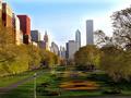
Chicago (My Second Home)by RefocusedComment by redmoon: Bit too much of the unsharp mask tool going on here. The trees look fantastic though, almost like a painting - i think i might have been tempted to crop out some of the sky just to draw more attention to the (gorgeous) landscaping. I also love the fact that the image is so devoid of people. And, sigh, those trees. Plus, those buildings on the left - great old architecture. Lighting is very good. Perhaps half a dozen steps to your right might have given a more symmtrically pleasing result but in all, very good. I'm probably docking you a point for the excessive unsharpening, but i don't think i'm being unfair giving an 8. |
 Photographer found comment helpful. Photographer found comment helpful. |
| 04/30/2004 01:47:13 AM |
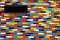
Bricksby RefocusedComment by photom: Very nice "pattern shot" - great colors. Not sure I can see any proportion.... |
| Photographer found comment helpful. |
| 04/29/2004 01:32:48 PM |
|
| Photographer found comment helpful. |
| 04/29/2004 06:44:52 AM |
|
| Photographer found comment helpful. |
| 04/28/2004 07:43:23 PM |
|
| Photographer found comment helpful. |
| 04/28/2004 06:00:27 PM |
Bricksby RefocusedComment by bbmohr: great colors. Maybe would look better with the vent in a different place in the composition... No, I think you cropped well. 7. |
| Photographer found comment helpful. |
| 04/28/2004 04:48:52 PM |
Bricksby RefocusedComment by bruski: Great color and composition. The vent(or whatever it is) really stands out and pulls your eye to the difference even though the rest of the image is so busy. |
| Photographer found comment helpful. |
| 04/28/2004 04:16:09 PM |
Bricksby RefocusedComment by melismatica: This would have been a far more striking abstract without the black grate in the top left corner. I don't really see how that adds to the idea of proportion or lack of it unless you want to argue that the distracting grate adds a lack of proportion to the image. The problem there is, it does so in an unpleasing way and uninteresting way. I think focusing more tightly on fewer bricks and shooting straight ahead instead of slightly up would have made a more powerful statement about the proportion in the design of these colorful bricks. The slight tilt upward is skewing the design. |
| Photographer found comment helpful. |
| 04/28/2004 03:48:00 PM |
|
| Photographer found comment helpful. |
| 04/28/2004 01:29:43 PM |
Bricksby RefocusedComment by menardmam: that picture dont stop to get my attention... event if i dont understand what kind of proportion it show.... it is quite nice.... |
| Photographer found comment helpful. |
Home -
Challenges -
Community -
League -
Photos -
Cameras -
Lenses -
Learn -
Help -
Terms of Use -
Privacy -
Top ^
DPChallenge, and website content and design, Copyright © 2001-2026 Challenging Technologies, LLC.
All digital photo copyrights belong to the photographers and may not be used without permission.
Current Server Time: 07/29/2026 09:02:20 PM EDT.