| Image |
Comment |
| 10/01/2004 03:41:32 PM |
|
 Photographer found comment helpful. Photographer found comment helpful. |
| 10/01/2004 12:51:55 PM |
|
| 10/01/2004 11:54:40 AM |
|
| 10/01/2004 11:52:44 AM |
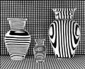
Vases Filled With Waterby RefocusedComment by willem: I wonder how many people will notice the structure of lines in the vases is not all the same and does not match the background. Did you put separate cardboard with lines behind them ? Very nice. I find the very slight irregularities in the background material distracting, nothing major, but not perfect. Cropping in the middle of the last dark line on the left would have reduced attention to that. |
| Photographer found comment helpful. |
| 10/01/2004 11:16:59 AM |
|
| Photographer found comment helpful. |
| 10/01/2004 09:41:02 AM |
Vases Filled With Waterby RefocusedComment by whatdewuc: What an interesting study of lines and curves. Amazing shapes that water creates. Slight wrinkles on bottom right a little distratcing. I like the horizontal, arch, and vertical stripes in the vases. Great study. |
| Photographer found comment helpful. |
| 10/01/2004 04:23:51 AM |
|
| Photographer found comment helpful. |
| 10/01/2004 01:45:02 AM |
|
| Photographer found comment helpful. |
| 10/01/2004 12:05:37 AM |
Vases Filled With Waterby RefocusedComment by Artyste: woah.. man.. I think you've single-handedly caused me to need glasses. Incredible idea, the lines and B&W just shout out at you as loud as they can. Only problem I have is that I'm not getting the strongest compositional feel from it, but damned if I can explain why. |
| Photographer found comment helpful. |
| 09/30/2004 10:40:37 PM |
|
| Photographer found comment helpful. |
Home -
Challenges -
Community -
League -
Photos -
Cameras -
Lenses -
Learn -
Help -
Terms of Use -
Privacy -
Top ^
DPChallenge, and website content and design, Copyright © 2001-2026 Challenging Technologies, LLC.
All digital photo copyrights belong to the photographers and may not be used without permission.
Current Server Time: 05/12/2026 07:46:54 AM EDT.