| Image |
Comment |
| 05/01/2005 10:01:32 PM |
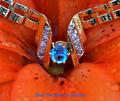
The Giftby RefocusedComment by Spork99: I know it's a flower, but when I first looked at it, it looked like one of those medical endoscope photos. Not really something I would want associated with jewelry. |
| 05/01/2005 05:33:51 PM |
|
 Photographer found comment helpful. Photographer found comment helpful. |
| 05/01/2005 02:23:39 PM |
|
| Photographer found comment helpful. |
| 05/01/2005 11:34:04 AM |
The Giftby RefocusedComment by NathanWert: Interesting. The wording is lost with the blue and size. Appears like the DOF, could have been moved a tad closer to the jewel itself instead of the band. Or that could just be my eyes having a problem focusing on the jewel. |
| Photographer found comment helpful. |
| 05/01/2005 04:08:28 AM |
The Giftby RefocusedComment by Brad: Unusually bright in a way, and is certainly one to pop off the page.
The Red/Orange is bolder than it really should be for an advertisement. The chice of the blue text to match the color of the stone would normally be good, but is very difficult to read against that color background. (5) |
| Photographer found comment helpful. |
| 04/30/2005 11:40:18 PM |
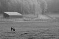
Grazingby RefocusedComment by JPR: wonder scene. nice black and white brings attention to the horse with the most black. one of the best i've seen so far. |
| Photographer found comment helpful. |
| 04/30/2005 05:58:57 PM |
|
| Photographer found comment helpful. |
| 04/30/2005 03:30:50 PM |
The Giftby RefocusedComment by GeneralE: The stone looks great. I think I'd have just used black for the type, I find this combination harder to read. |
| Photographer found comment helpful. |
| 04/30/2005 02:13:31 PM |
The Giftby RefocusedComment by Catherine_B: beautiful piece of jewelry that isn't being presented well in this photo. The water drops really detract from the image. The blurry foreground makes it hard to focus on the subject the necklace. The item is also not positioned straight and symetrically which also detracts from the "ad" image |
| 04/30/2005 01:46:41 PM |
The Giftby RefocusedComment by LadeeM: I really like this ... except for the blue text. It's hard on the eyes against the orange flower. Otherwise, comp is good, and the jewels are clear and shining. And the water adds a nice touch. |
| Photographer found comment helpful. |
Home -
Challenges -
Community -
League -
Photos -
Cameras -
Lenses -
Learn -
Help -
Terms of Use -
Privacy -
Top ^
DPChallenge, and website content and design, Copyright © 2001-2026 Challenging Technologies, LLC.
All digital photo copyrights belong to the photographers and may not be used without permission.
Current Server Time: 08/05/2026 01:10:47 AM EDT.