| Image |
Comment |
| 06/16/2003 01:37:01 AM |
|
 Photographer found comment helpful. Photographer found comment helpful. |
| 06/15/2003 06:15:41 PM |
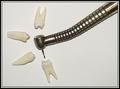
This Won't Hurt A Bitby RefocusedComment by KimInNB: Thanks for reminding me that I have an appointment on Tuesday!!! I hope you're one of the "nice" dentists who don't enjoy inflicting pain. Photographically speaking, I think the photo could have been better with a coloured background. I really like the placement of the teeth. |
| Photographer found comment helpful. |
| 06/15/2003 12:23:38 PM |
|
| Photographer found comment helpful. |
| 06/15/2003 12:09:11 AM |
|
| Photographer found comment helpful. |
| 06/14/2003 08:34:08 PM |
|
| Photographer found comment helpful. |
| 06/14/2003 09:05:28 AM |
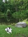
Country Magazineby RefocusedComment by MarkS224: Very nice, good composition useing the rule of thirds. Plenty of room forTitle and articles, and a definate "country living" feeling |
| 06/13/2003 02:36:44 PM |
|
| 06/13/2003 01:41:40 AM |
|
| 06/12/2003 03:45:43 PM |
|
| Photographer found comment helpful. |
| 06/12/2003 11:46:38 AM |
|
Home -
Challenges -
Community -
League -
Photos -
Cameras -
Lenses -
Learn -
Help -
Terms of Use -
Privacy -
Top ^
DPChallenge, and website content and design, Copyright © 2001-2026 Challenging Technologies, LLC.
All digital photo copyrights belong to the photographers and may not be used without permission.
Current Server Time: 07/23/2026 01:24:07 PM EDT.