| Image |
Comment |
| 07/23/2003 09:36:50 AM |
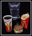
Fast Food, Slow Deathby RefocusedComment by Imagineer: Like the way you're thinking! Could have been better lit and maybe shooting from a lower angle, closer to the burger, would have added 'gravitas' to the humour. [5] |
 Photographer found comment helpful. Photographer found comment helpful. |
| 07/23/2003 06:24:24 AM |
Fast Food, Slow Deathby RefocusedComment by rhipster: I love the idea - message. Composition is good, black background effective. Lighting should be better.
Halas i dislike totaly the white thick border. Good photo anyway |
| Photographer found comment helpful. |
| 07/23/2003 05:37:01 AM |
|
| Photographer found comment helpful. |
| 07/23/2003 03:58:41 AM |
|
| Photographer found comment helpful. |
| 07/23/2003 01:54:54 AM |
|
| Photographer found comment helpful. |
| 07/23/2003 12:22:19 AM |
|
| Photographer found comment helpful. |
| 07/21/2003 11:39:20 PM |
Light and Shadowsby RefocusedComment by wetland: Very nice photograph. Without the challenge constraints, would be great to have everything in B&W except the orange in the daisies. thanks |
| Photographer found comment helpful. |
| 07/21/2003 10:22:44 PM |
|
| 07/21/2003 01:18:54 PM |
Light and Shadowsby RefocusedComment by RiderGal: This is stunning... and is perfect for the challenge. Very interesting what you did here, and incredible job on the lighting! Some great leading lines... -9- |
| Photographer found comment helpful. |
| 07/19/2003 07:28:30 PM |
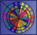
Color Wheelby RefocusedComment by narliss: Interesting phot. It looks like a painting. Would a different perspective have made the subject seem more three dimensional? |
Home -
Challenges -
Community -
League -
Photos -
Cameras -
Lenses -
Learn -
Help -
Terms of Use -
Privacy -
Top ^
DPChallenge, and website content and design, Copyright © 2001-2026 Challenging Technologies, LLC.
All digital photo copyrights belong to the photographers and may not be used without permission.
Current Server Time: 07/23/2026 10:54:01 AM EDT.