| Image |
Comment |
| 05/13/2006 03:09:36 AM |
|
 Photographer found comment helpful. Photographer found comment helpful. |
| 05/13/2006 02:37:34 AM |
|
| Photographer found comment helpful. |
| 05/12/2006 07:52:54 PM |
|
| Photographer found comment helpful. |
| 05/12/2006 01:48:35 PM |
teaby bucketComment by Arti-Elvi: I love this one. I feel like a kid again when I see this photo. The expression on the girl's face is great. |
| Photographer found comment helpful. |
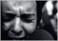
| 05/12/2006 12:39:56 PM |
Anguishby bucketComment by eschelar: Ok, here's what I would do to fix this picture...
Nothing....
Here's what I would probably play with to try to fix the picture: Grunge filter, dodging the teardrop, uhh not much else.
In the end, I'd probably hit 'revert' and go with what you have here... if I had the good sense in the moment...
It's a very stark, very gritty shot that turned out really great IMHO.
The focus doesn't seem to be at all bad, landing right about where that teardrop is.. The defocused areas appear pretty well balanced. The crop is very strong and edgy... The shot is imperfect in all the right ways... Another victim of narrow minded voters IMHO. |
| Photographer found comment helpful. |
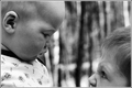
| 05/12/2006 11:09:49 AM |
Siblingsby bucketComment by elru21: Greetings from the Critique Club,
What an interesting and creative image I drew to critique. I really like this one.
I think this unconventional framing and composition of this image really makes you stop to study it and think about the moment that has been captured. I like the way the camera angle is on the boys' level and how it is cropped so close. It concentrates the viewer on the expression and interaction between them. I especially like the way only the eye and wrinkled nose on the older boy is shown. I like how the baby is higher up than his older brother. The whole image really tells a story. It is very engaging. WEll done.
A small nitpick about the crop is how the ear of the baby is a little distracting and leads my eye towards the edge of frame. THe larger negative element in this image is the background. It is too high contrast and busy, which is very distracting especially becuase it takes up the middle of the frame. Maybe burning it down and/or blurring could help with this.
I love commenting on a free study, because I don't have to address how well the image met the challenge!
Please feel free to pm me with any questions about my comments. Excuse the typos :)
Cheers,
Liza |
| Photographer found comment helpful. |
| 05/12/2006 04:26:40 AM |
|
| Photographer found comment helpful. |
| 05/10/2006 09:38:13 PM |
|
| Photographer found comment helpful. |
| 05/10/2006 01:45:53 PM |
|
| Photographer found comment helpful. |
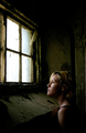
| 05/10/2006 01:11:07 PM |
Dirty Pretty Crimeby bucketComment by posthumous: maybe it should be Criminal? Regardless, great image, wonderful use of light, dramatic composition with lots of room for text up top. |
| Photographer found comment helpful. |
Home -
Challenges -
Community -
League -
Photos -
Cameras -
Lenses -
Learn -
Help -
Terms of Use -
Privacy -
Top ^
DPChallenge, and website content and design, Copyright © 2001-2026 Challenging Technologies, LLC.
All digital photo copyrights belong to the photographers and may not be used without permission.
Current Server Time: 06/25/2026 07:09:17 AM EDT.