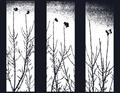
Last Men Standingby
chefsamComment by CEJ: Hello from the Critique Club!
I have studied your image and have the following to offer:
Composition/perspective – I am not sure about your choice of sizing/spacing on the panels. When I look at it I get the feeling I am looking through a barred window rather than at a triptych image. The center and side divisions are a little wide compared to the top and bottom borders. With the processing it is hard to tell about focus or too many image properties themselves. The starkness of the image helps support your subjects which are otherwise a little uninteresting. The division is also a little distracting. The branches don’t line up from panel to panel and the eye naturally tries to do this. This indicates to me the image was not simply split, but cropped three different times and/or more than one perspective was used. I think this is one element that weakens the image as a whole - the right edge of panel one and left edge of panel two are the same yet the perspective is not quite the same. With a lack of detail and/or color to make up for/hide or otherwise distract from this disparity, I find it confusing to look at for very long. There is just not enough to grab the attention to make up for this.
Color – b/w, solid black and bright white, not may shades of gray except in the top. The white is a little bright in the center of all three panels. The brightness starts to wash over the black branches. It totally distorts the leaves(?) at the top making some of them appear detached.
Lighting – very hard to tell with this image. The processing has hidden most details of the image that would help here.
Challenge requirements – by definition this meets the challenge requirements. However, the processing – the wide divisions – make this appear more as though you are looking at three similar images meant to be viewed separately as opposed to a triptych image.
Overall/my opinion – the weakest part of this image is the processing. It takes away any character the branches and/or leaves may have had on their own. The sky texture looks totally created and not natural at all. The bright white takes detail and definition away while making the outlines appear rougher than they probably are. The separation between panels is a bit wide and gives a heavy appearance to the shot.