| Image |
Comment |
| 03/27/2003 09:46:01 PM |
|
| 03/27/2003 06:52:13 PM |
|
| 03/27/2003 02:28:38 AM |
|
 Photographer found comment helpful. Photographer found comment helpful. |
| 03/26/2003 11:39:19 PM |
Timelessby DougPazComment by dsidwell: Very nice perspective here. I love how the vertical lines are augmented by the diagonals! The light is a bit harsh, but this is a very clear photo. |
| Photographer found comment helpful. |
| 03/26/2003 07:18:01 PM |
Timelessby DougPazComment by Swashbuckler: Beautiful blue sky! Very nice contrast with the building. Focus seems really good. Challenge totally met. I really like the little figurine on top of the clock tower. 9 Swash |
| Photographer found comment helpful. |
| 03/26/2003 12:14:34 PM |
|
| Photographer found comment helpful. |
| 03/25/2003 08:08:05 PM |
|
| 03/25/2003 02:40:57 PM |
|
| Photographer found comment helpful. |
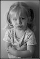
| 03/25/2003 01:10:30 PM |
Jugglingby DougPazComment by DrJOnes: Greetings from the Critique Club!
Good try with this one! It shows you are trying to be creative.
The composition is what works best in this photo. The horizontal cropping works really well and the cropping is just right. The outfit, colors and expression are excellent too. Unfortunately, there's just too much blur. It could have been solved with a faster shutter speed. Raising the shutter speed would have been a tough compromise because we would have lost some of the interesting blur effect in the balls and arms, loosing at the same time the the dynamic energy from them. But it seems it would have been better with a face in focus and sharp in order to really connect with the juggler.
The photo is on par with the challenge's theme. The view from above really adds to the composition.
In short: excellent compostion, nice colors, excellent cropping, nice expresion. Unfortunately, the overload of blur is simply too distracting to appreciate the photo. 4
Keept up the good work!
|
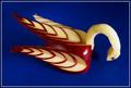
| 03/24/2003 10:30:04 PM |
Kitchen Artistryby DougPazComment by indigo997: HEY!
That's a nifty little party trick - really fits the challenge well!
I think that the score reflects an appreciation for the subject as much as anything else.
The colors work well together. I like that the apple is turned slightly, but I'm wondering what other angles you tried - maybe something from a little lower instead of above. Lighting is good. It's a bit bright on the fleshy neck and that one glaring hot spot on the right side - did you diffuse the lighting? Lighting is really difficult, and you did a good job of avoiding harsh shadows. Somehow, it even seems a bit dark still... I think that more lighting and a different angle would help it seem more 3D. I also don't really understand the anatomy. It seems like the neck should be between the wings... but then there's a 3rd wing? Maybe a different angle would help with that too - so that it would make more sense. Something is just a bit weird with this bird.
Did you use lemon juice? If not, you must've shot fast because I can barely see any discoloration.
I don't think you really needed the frame, but it looks ok. I don't particularly like colored frames, but this one is matches well enough not to detract from the image.
Excellent score! Congrats. I'm gonna go eat an apple now ;P |
| Photographer found comment helpful. |
Home -
Challenges -
Community -
League -
Photos -
Cameras -
Lenses -
Learn -
Help -
Terms of Use -
Privacy -
Top ^
DPChallenge, and website content and design, Copyright © 2001-2026 Challenging Technologies, LLC.
All digital photo copyrights belong to the photographers and may not be used without permission.
Current Server Time: 06/16/2026 02:16:22 AM EDT.