| Image |
Comment |
| 05/23/2003 10:37:37 AM |
|
 Photographer found comment helpful. Photographer found comment helpful. |
| 05/22/2003 04:45:44 PM |
Tiffany Rosebudby DougPazComment by karmat: Good focus and lighting. I think it would have benefited from a more dramatic angle or perspective. |
| Photographer found comment helpful. |
| 05/22/2003 02:09:19 PM |
Tiffany Rosebudby DougPazComment by qachyk: Hmm. The red/green contrast is there, but the yellow undermines this completely. Still, nice framing of the rose. It's also interesting how the top almost looks like a road fading into infinity. |
| 05/22/2003 09:11:39 AM |
|
| Photographer found comment helpful. |
| 05/22/2003 05:06:04 AM |
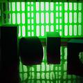
Inside...The Matrixby DougPazComment by e301: Suitably wierd, suitably green (though that, I thought, was an element that was easy to over-play), and suitably mysterious. I think there's enough interest without the objects top left and mid-right, which interrupt the smoothness of the image for me: the distortion of the patern in the green screen thingy, and the simple oddness of those shapes seen like this are enough alone. In my opinion, of course. |
| Photographer found comment helpful. |
| 05/21/2003 01:48:57 PM |
|
| Photographer found comment helpful. |
| 05/21/2003 10:47:16 AM |
Morning Welcomeby DougPazComment by jmsetzler: Hi Doug...
I like the composition you chose here... the square crop you chose seems to work very well in isolating your subject...
One of the things I particularly do like is the visibility of the detail behind the neon sign. It's muted enough that it's not obtrusive, but visible enough that it gives some good context to the photo. If those details were not visible, this would just look like a cartoon image or a photoshop rendering of a neon sign. Those visible details seem to keep this shot 'photographic' in nature. I have seen a lot of neon sign photos where nothing was visible except the color of the sign... I like the way this one turned out.
I think this shot would make a good 'product' photo in the neon sign industry. I have been fortunate enough to work with some sign makers in the past, and building neon signs is tough work. These people take pride in making a sign stand out like this and the inner workings of the sign is an art to them...
Nice work...
John Setzler
|
| Photographer found comment helpful. |
| 05/21/2003 10:39:20 AM |
Morning Welcomeby DougPazComment by Kavey: I know the critique below isn't very long, I'm going to ask a fellow CCer to have a look at this image also for a different perspective, and hopefully, some additional insights. |
| Photographer found comment helpful. |
| 05/21/2003 10:36:07 AM |
Morning Welcomeby DougPazComment by Kavey: Critique Club
Initial thoughts
Interesting content, nice crop, distracting bits and pieces…
Composition/ Content
I like the contents – I think it’s an interesting detail to focus in on and I like the composition: text at bottom, slanting angle of the cup and negative space to top left corner.
IMO it’s a shame that the supporting structure to the neon tubes is so clearly visible and the white fairy lights at top left don’t add anything.
Neon colours are nicely captured, muted and appealing.
Fits The Challenge
Yes
My Opinion On The Photo
Attractive but not enough high interest.
|
| Photographer found comment helpful. |
| 05/21/2003 12:55:24 AM |
Inside...The Matrixby DougPazComment by carolee: I like that this appears to actually BE green rather than be a photoshop job. The cage effect as well as the reflection and abstract shapes are great. Reminds me of children's toys -- is that what they are? Great interpretation of the challenge! |
| Photographer found comment helpful. |
Home -
Challenges -
Community -
League -
Photos -
Cameras -
Lenses -
Learn -
Help -
Terms of Use -
Privacy -
Top ^
DPChallenge, and website content and design, Copyright © 2001-2026 Challenging Technologies, LLC.
All digital photo copyrights belong to the photographers and may not be used without permission.
Current Server Time: 06/12/2026 04:48:40 PM EDT.