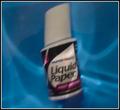
DPChallenge: A Digital Photography Contest You are not logged in. (log in or register
 
Browse Settings
Currently viewing:
Registered UserDougPaz

Show comments:

Per page:

Order:

Comments:


Comments Received by DougPaz
Pages:   ... [59] [60] [61] [62] [63] [64] [65] ... [186]
Showing 611 - 620 of ~1858
Image Comment
Refreshing Summer Drink
08/20/2003 12:17:20 AM
Refreshing Summer Drink
by DougPaz

Comment by Thomas:
A faster shutter speed and this would be so nice. Good pic
Awaiting Her Sweet Sailor
08/19/2003 05:59:31 AM
Awaiting Her Sweet Sailor
by DougPaz

Comment by vjoz:
good idea, this is maybe a pretty small pier, for some ship to come to ;)
is this candid? - well done, I'd like the yellow thing out though, if it was candid you couldn't do anything about it, so...

giving you an 7 I think...
Photographer found comment helpful.
Awaiting Her Sweet Sailor
08/18/2003 03:16:57 PM
Very Liquid Paper
06/21/2003 01:48:21 PM
Very Liquid Paper
by DougPaz

Comment by dsidwell:
Greetings from the Critique Club!

I'm surprised this shot didn't do as well as it did. I think it shows an originality and cleverness to it that really makes it whimsical and a bit quirky.

The idea itself is great. The double visual pun works fantastically. I think you made the right choice in centering the subject, as it is not in your implication to suggest that the scene goes beyond, or that this part of any other world other than the world of the photo, which is what I feel happens when one uses the rule of thirds.

The lighting is nicely done, too. I like the many highlights and underwater textures you've managed to create. Your pont of view is just right, too. Straight on seems very important here, and I like how the bottle is tilted just a little.

Some folks below have mentioned focus, and I also feel that the shot would be enhanced with sharper focus on the bottle, even if only some of it ends up in focus because of the moving water patterns. I think t his would actually increase the sense of water here, and enhance the sense that the image was being distorted by the water. I'm not even sure that getting the bottle in focus is even possible.

Some mentioned that they'd like to see it a little brighter, and I think this is a taste issue. I don't mind darker shots, but it is certainly something that you may want to experiment with.

In sum, this is a fun, clever shot that made me chuckle, and I think you used most elements to your advantage here. Nice work!

Good luck in the challenges, and I look forward to seeing more of your excellent work in the future!

David
Very Liquid Paper
06/15/2003 12:12:47 AM
Very Liquid Paper
by DougPaz

Comment by jkiolbasa:
Goofy focus, and a little underexposed. Try a more interesting comosition, other than a dead-center head-on shot.
Very Liquid Paper
06/12/2003 12:50:34 AM
Very Liquid Paper
by DougPaz

Comment by kejidi:
This 'Office Art' photo jumped at me the first viewing round I gave the selections and stayed with me throughout the entire viewing time. Different to say the least; unique and certainly a given for the first 'Office Art "Coffee Table" Book'.
Photographer found comment helpful.
Sizzling Morning Campfire
06/11/2003 07:24:53 PM
Sizzling Morning Campfire
by DougPaz

Comment by OneSweetSin:
*Critique Club*

Nice image well done in good focus. Meets challenge cause you can almost hear the bacon cooking when you look at it. Actually right now I think I can smell it too. =o)

Only real thing I see to improve upon this image is it appears a little undercooked and overexposed in the one end of the skillet. Nice overall look though, well done.

Anna

Sorry for the pun couldn't help myself.
Photographer found comment helpful.
Very Liquid Paper
06/11/2003 05:28:43 PM
Very Liquid Paper
by DougPaz

Comment by pinback:
Nice idea - good play on the subject. I know its underwater, but I'd still like the subject to be sharper.
Photographer found comment helpful.
1101 Lili Lane
06/10/2003 10:33:00 PM
1101 Lili Lane
by DougPaz

Comment by HBunch:
*Critique Club*
I can't decide weather or not I like the sign or think it distracts from the home. I think that it is a nice artistic touch, not just a plain old ordinary shot of a house, but it's right dead center of the house, so I'm thinking that maybe I wish it could be in a different spot.
The focus and clarity of both the house and the sign are good. you show us nice detail in the brick of this house and also make the text on the sign very readable and clear.
The lighting lookd alright. ALMOST a little bright on the sign, but not quite. The sky looks good. Not white and blown out as I see so often.
The car doesn't bother me at all. Gotta have a car with the house. Right?
The colors are really good. Stand out nicely, and are vivid and perfect.
Overall a nice shot. still undecided on the sign though.
~Heather~
Photographer found comment helpful.
Very Liquid Paper
06/09/2003 12:45:30 PM
Very Liquid Paper
by DougPaz

Comment by eikidigi:
need better focus
Pages:   ... [59] [60] [61] [62] [63] [64] [65] ... [186]
Showing 611 - 620 of ~1858


Home - Challenges - Community - League - Photos - Cameras - Lenses - Learn - Help - Terms of Use - Privacy - Top ^
DPChallenge, and website content and design, Copyright © 2001-2025 Challenging Technologies, LLC.
All digital photo copyrights belong to the photographers and may not be used without permission.
Current Server Time: 09/10/2025 10:36:20 AM EDT.