| Image |
Comment |
| 01/01/2003 09:00:26 PM |
-En el camino otra vez-On the road again--by justineComment by PTLParsons: No black and white with these beautiful artifacts from Mexico. You just commited the deadly sin in my book. Mexican things have such beautiful colors, and I love to see the colors. Shame, shame. Went from a 9 down to a 6. Shame. PTL To ahve been a 9 you know it had to be a flauless photo with pizazz. |
| 12/31/2002 05:41:50 AM |
Chrome Domeby justineComment by LindaLee: Good, clear, simple and straightforward - I like this shot, but personally would have cropped a little more from the left side. |
 Photographer found comment helpful. Photographer found comment helpful. |
| 12/30/2002 08:23:57 PM |
Chrome Domeby justineComment by akcoffeeguy: This shot would have looked great if you would have cropped him off to the far left side, leaving the right side open. Otherwise it looks great
|
| Photographer found comment helpful. |
| 12/30/2002 07:09:56 PM |
|
| Photographer found comment helpful. |
| 12/29/2002 08:44:25 PM |
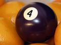
'Fourda Oranges'by justineComment by PTLParsons: Too tightly cropped for me. Makes it appear cramped. In my opinion either spread it out and zoom out some; or just have 4 oranges and the 4 ball. The focus is good and the light is good. I would also have it all in focus so the 4 ball would be an emphasis to the 4 oranges, to emphasize the brand of your title. Still a decent shot. PTL 6 |
| 12/29/2002 05:46:02 PM |
|
| 12/27/2002 11:28:19 PM |
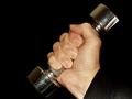
Hand Playby justineComment by HBunch: Excelent body part shot. I like the angle and framing/cropping you have chosen for this. The lighting is really good. You did an excelent job of keeping the reflection and glare down on the dumbell. The only thing that stands out to me is the bottom right corner has a strange color, like reflection on the shirt or something. Otherwise, a nice shot. Good luck in the challnege. |
| Photographer found comment helpful. |
| 12/27/2002 02:26:34 PM |
|
| Photographer found comment helpful. |
| 12/26/2002 11:25:49 PM |
Hand Playby justineComment by lisae: The light here is too harsh. The tension in the fingers is a cool idea, but it isn't shown off well by the lighting. I think this could have worked well in black and white. The composition is a little bit awkward to me. |
| 12/25/2002 10:57:32 AM |
|
Home -
Challenges -
Community -
League -
Photos -
Cameras -
Lenses -
Learn -
Help -
Terms of Use -
Privacy -
Top ^
DPChallenge, and website content and design, Copyright © 2001-2026 Challenging Technologies, LLC.
All digital photo copyrights belong to the photographers and may not be used without permission.
Current Server Time: 07/27/2026 02:15:35 PM EDT.