| Image |
Comment |
| 05/05/2003 09:15:52 AM |
Welcome to Portlandby justineComment by deckyon: This could have used something to lessen the haze. also, the picture is tilted down to the right, 2 maybe 3 degrees. I also think the text is too much. Lower left corner and smaller, maybe.
I would love to visit Portland, BTW. |
| 05/05/2003 06:57:47 AM |
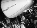
My Rideby justineComment by kiwiness: Interesting composition I like it. Shiny and polished surfaces and chrome always work well in B&W, good choice- 9. |
 Photographer found comment helpful. Photographer found comment helpful. |
| 05/04/2003 11:06:12 PM |
My Rideby justineComment by Bitz: This could be a magazine ad for Harley Davidson. Superbly focused and composed! |
| Photographer found comment helpful. |
| 05/04/2003 11:04:19 PM |
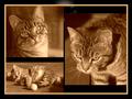
thrice a catby justineComment by xertion: I love cats and this is a great collection of cat pictures. Each picture really is great on it's own. The background with the white and the dark outline takes away from this shot and the duotone of the cat pictures seems very weird to me. All in all a fantastic shot of your cat! 10! |
| Photographer found comment helpful. |
| 05/04/2003 08:12:15 PM |
|
| Photographer found comment helpful. |
| 05/04/2003 05:29:54 PM |
thrice a catby justineComment by jmsetzler: excellent toning in these photos... something is a bit goofy in the top center background of the image though.... |
| Photographer found comment helpful. |
| 05/04/2003 04:02:48 PM |
My Rideby justineComment by Lew: Nice shot........ Color would not have been as effective IMHO. Game it a 10 |
| Photographer found comment helpful. |
| 05/03/2003 08:19:44 PM |
thrice a catby justineComment by kandyj: The eyes are a little light on the lower left image, but after having taken dozens of photos of my own cats, I know how hard it is to get a decent photo without flash. I don't understand the light/dark areas in the upper background, though. |
| Photographer found comment helpful. |
| 05/02/2003 12:33:06 AM |
thrice a catby justineComment by seasaw: Good expressions on the cat. I don't care for what looks like a ring of light on the black background at the top. It pulls my eyes away from the real subjects. |
| Photographer found comment helpful. |
| 05/01/2003 07:13:27 PM |
thrice a catby justineComment by Jacko: I love cats. Nice set up. Good job on the sepia. I'll give you a 10 to counter balance the cat haters + it's a real nice shot. Jacko. 10 |
| Photographer found comment helpful. |
Home -
Challenges -
Community -
League -
Photos -
Cameras -
Lenses -
Learn -
Help -
Terms of Use -
Privacy -
Top ^
DPChallenge, and website content and design, Copyright © 2001-2026 Challenging Technologies, LLC.
All digital photo copyrights belong to the photographers and may not be used without permission.
Current Server Time: 07/27/2026 08:46:29 PM EDT.