| Image |
Comment |
| 06/18/2003 01:28:14 AM |
Me-Myselfby justineComment by breezy: The soft effect and the choice to pose off center adds interest to your photo, and is well done. |
 Photographer found comment helpful. Photographer found comment helpful. |
| 06/17/2003 11:36:20 AM |
|
| Photographer found comment helpful. |
| 06/17/2003 06:58:32 AM |
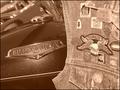
American Iron Magazineby justineComment by Kavey: Nice textures and interesting combo of materials and metal objects. Don't like sepia choice - seems too "Little House on the Prairie" for the sunject matter chosen. |
| Photographer found comment helpful. |
| 06/16/2003 05:54:35 PM |
|
| Photographer found comment helpful. |
| 06/16/2003 03:02:57 PM |
|
| Photographer found comment helpful. |
| 06/16/2003 02:35:34 PM |
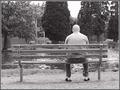
'A world off center'by justineComment by Pidd: This is the third park bench shot I've seen in this challenge and I like it just as well as the other two, but for a different reason. Although similar to the others in that it is the park bench theme and you kept it in black and white, it is very different as well. In the other picures, the bench itself was the off-center subject. In yours, you centered the bench but made the man the off-center focal point. I love this because it caused me to realize an act of human nature, that whenever we sit on a park bench, we almost always choose to sit on one side or the other, not the center. Why is that? To me, photography is much more than the picture--it is how you capture the essense of what you are photographing. I like how you did that here. Thank you for this wonderful picture. I can't vote on this challenge, but if I could, you'd be among my highest marks. |
| Photographer found comment helpful. |
| 06/16/2003 10:20:32 AM |
'A world off center'by justineComment by alanfreed: Nice subject -- good idea! It seems like the wood in the bench gets a little lost in the river. I'm not sure how I'd suggest getting around that -- perhaps by shooting from a lower angle upward so that the trees are in the background of the bench? - 6 |
| Photographer found comment helpful. |
| 06/16/2003 01:51:08 AM |
|
| Photographer found comment helpful. |
| 06/14/2003 01:07:44 PM |
American Iron Magazineby justineComment by kyrielle: This is a nice shot, overall, but I have trouble envisioning where magazine text would go other than in a neutral frame, if one were placed around it. The contrast between the smooth/sleek bike and the patterns and crowded feel of the patches to the right is really nice and works well, though. |
| Photographer found comment helpful. |
| 06/13/2003 04:35:30 PM |
|
Home -
Challenges -
Community -
League -
Photos -
Cameras -
Lenses -
Learn -
Help -
Terms of Use -
Privacy -
Top ^
DPChallenge, and website content and design, Copyright © 2001-2026 Challenging Technologies, LLC.
All digital photo copyrights belong to the photographers and may not be used without permission.
Current Server Time: 07/28/2026 06:59:07 AM EDT.