| Image |
Comment |
| 06/22/2005 02:58:13 PM |
|
 Photographer found comment helpful. Photographer found comment helpful. |
| 06/22/2005 09:21:24 AM |
|
| Photographer found comment helpful. |
| 06/22/2005 12:31:56 AM |
|
| Photographer found comment helpful. |
| 06/21/2005 04:09:54 AM |
|
| Photographer found comment helpful. |
| 06/20/2005 08:37:43 PM |
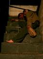
Aloneby holdingtimeComment by JunieMoon: Very powerful photo.. Since it appears you had to use a slow shutter, the image is a little blurred. Even with a tripod it would have been hard for sharp focus. I had the same problem. I guess the only way is to get a better camera, though I'm not ready to invest just now. |
| Photographer found comment helpful. |
| 06/20/2005 02:53:11 PM |
Aloneby holdingtimeComment by Artifacts: Certainly meets the challenge. You've capture darkness well.
There are a couple things that will hold down the score of this image. One is that the theme of alcholism is well represented in this challenge and voters will become jaded with it.
Just because of the theme this image would probably be better if it were converted to B&W. The color in this image does not add much to your message and B&W generally works better for images of this type.
The stairs are not level and that acts as a distraction. If that were intentional then you would need a steeper angle to be meaningful to viewers.
It looks like this image was taken with flash. In that case it might be better if you had stepped to the right slightly so the flash would illuminate the left as well as the right sides of the image. This could have been done purposefully, but will not look like it to casual viewers unless you move the flash further to the left to increase the shadow length. |
| Photographer found comment helpful. |
| 06/19/2005 12:43:06 PM |
Aloneby holdingtimeComment by howardj: Definitely a strong image. I think you could have made it even better by using some tape or something to block the light showing through the gap between the door and door frame, and by making the foot look dirty: as it is it looks too clean. Given that he looks asleep or passed out the lit cigarette also looks a little out of place. |
| Photographer found comment helpful. |
| 06/18/2005 08:39:30 PM |
|
| Photographer found comment helpful. |
| 06/17/2005 05:41:53 PM |
Aloneby holdingtimeComment by Minstrel: i think it looks posed. i apologize if it's not, but that's the impression i get because of the lit cigarette and the exposed tatt. |
| Photographer found comment helpful. |
| 06/17/2005 02:59:27 AM |
|
| Photographer found comment helpful. |
Home -
Challenges -
Community -
League -
Photos -
Cameras -
Lenses -
Learn -
Help -
Terms of Use -
Privacy -
Top ^
DPChallenge, and website content and design, Copyright © 2001-2026 Challenging Technologies, LLC.
All digital photo copyrights belong to the photographers and may not be used without permission.
Current Server Time: 07/17/2026 10:18:40 AM EDT.