| Image |
Comment |
| 12/24/2002 03:12:26 PM |
|
| 12/24/2002 11:52:17 AM |
|
| 12/23/2002 04:33:46 PM |
|
| 12/23/2002 01:24:02 PM |
|
| 12/23/2002 10:46:48 AM |
|
| 12/22/2002 11:53:28 PM |
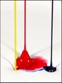
Sherwin-Williams Paint, Ops Mgrby falveyComment by PTLParsons: Cute - good focus, nice texture. I wish the shadows weren't there. Otherwise the paint is very pristine. Like the indention the yellow paint makes, drawing the red into it's hole. Think I understand your reasoning for the frame but that shows the paints to be off center, and for no real reason. With out the frame I probably wouldn't have noticed the cropping. For me this cost you a point. 8 PTL |
| 12/20/2002 07:46:31 PM |
Sherwin-Williams Paint, Ops Mgrby falveyComment by Bullwinkle: The concept is well taken. Graphic bold simple images seem to be the way to rack up points here at DPC. So you are on the right track. I would have chosen a lighter colour blue. I am asking for the impossible for more swirly effect in the other colours besides red to bring visual motion/impact there too. But that would be another 100 shots later. I would be happy with one set or even no grey shadows on the white ( sorry for being so bloody picky over nothing ). This is a good image well on the way to becoming an excellent shot. Keep up the great work...7 bullwinkle |
| 12/20/2002 08:37:11 AM |
|
| 12/19/2002 11:57:39 PM |
|
| 12/19/2002 03:27:24 PM |
|
Home -
Challenges -
Community -
League -
Photos -
Cameras -
Lenses -
Learn -
Help -
Terms of Use -
Privacy -
Top ^
DPChallenge, and website content and design, Copyright © 2001-2026 Challenging Technologies, LLC.
All digital photo copyrights belong to the photographers and may not be used without permission.
Current Server Time: 07/17/2026 04:49:10 PM EDT.