| Image |
Comment |
| 01/24/2003 07:42:00 AM |
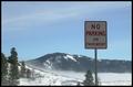
Roadlessby falveyComment by STEINR: NIce background and nice picture. However, if this was supposed to be a picture of a road sign, the sign should have proabably been a little brighter. 7 |
 Photographer found comment helpful. Photographer found comment helpful. |
| 01/24/2003 12:06:44 AM |
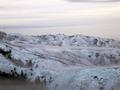
Misty Mountainsby falveyComment by RiderGal: Critique Club
This photo is pretty neat with the blanket of clouds/mist covering it. I think it really gives it an eerie untouched sense which is very cool. I think i would have maybe tried taking away about 1/3 of the extra sky... it might have improved the composition a little bit, but thats just personal preference. Since this shot isn't quite blue, but tries to be, I think it may have looked cool in black and white... or you might have tried using a polarizing filter on it to bring out more dramatic colors, but maybe you like the soft look of the light blue, thats up to you as the photographer. I like the softness of this photo, it's not sharpened which I think gives it a nice look, not every picture has to be tack sharp. I like your exposure on this picture, as well as the lighting... everything is pleasantly lit with no harsh shadows, and you can pretty much make out all the details which is very nice. I think this is a very cool landscape, that must have been fairly hard to get (and cold) you did a nice job with it. :-) good luck with your next challenges!
-Talya |
| 01/23/2003 11:47:28 AM |
|
| 01/23/2003 08:03:57 AM |
|
| 01/23/2003 12:41:42 AM |
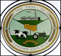
Dairy Queen of the Countiesby falveyComment by kandyj: Interesting way to meet the challenge. the only thing I might suggest is to have tried to eliminate the lines in the upper left edge of the photo that look like those darned power lines we all struggle with! |
| 01/22/2003 02:54:17 PM |
Roadlessby falveyComment by joshua: too much cropping. the road might actually have looked cool set against that background. the sign is too deark also |
| 01/21/2003 11:36:07 AM |
Roadlessby falveyComment by PTLParsons: Beautiful photo of the surroundings. But you should have shown some of the pavement, because that's what the sign is talking about. Course, this is just my opinion. I would have liked it better and felt it met the challenge better. I do love the photo. And will still give it a 6. |
| Photographer found comment helpful. |
| 01/20/2003 09:54:36 PM |
Roadlessby falveyComment by dodobird: Pavement, I see no stinking pavement. j/k Very cool shot I just love the fog. It kinda makes the shot a bit blurred. The placement of the sign in relation to the mountain and horizon is great. I may have improved the lighting somehow. The sign seems to be a tad too dark. I am not sure now that it is just the fog that blurred everything, the sign seems a touch fuzzy too. Overall great shot.8. |
| 01/20/2003 05:59:33 PM |
|
| 01/20/2003 03:00:29 AM |
|
Home -
Challenges -
Community -
League -
Photos -
Cameras -
Lenses -
Learn -
Help -
Terms of Use -
Privacy -
Top ^
DPChallenge, and website content and design, Copyright © 2001-2026 Challenging Technologies, LLC.
All digital photo copyrights belong to the photographers and may not be used without permission.
Current Server Time: 07/17/2026 07:37:54 PM EDT.