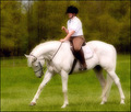
DPChallenge: A Digital Photography Contest You are not logged in. (log in or register
 
Browse Settings
Currently viewing:
Registered Userdocurrie

Show comments:

Per page:

Order:

Comments:


Comments Received by docurrie
Pages:   ... ... [110]
Showing 401 - 410 of ~1100
Image Comment
Wood Duck
05/28/2006 05:39:54 AM
Wood Duck
by docurrie

Comment by Breeee123:
Art really is subjective... this was one of the best photos in the challenge IMO (I gave it a 10). The duck really looks like one of those wooden carvings, and I love the soft, muted tones. The water is like something out of a Monet painting. Really beautiful.
Daughter's Proud Charger
05/20/2006 10:14:16 AM
Daughter's Proud Charger
by docurrie

Comment by karmat:
CRITIQUE CLUB CRITIQUE
by karmat

My first impression of this shot is that it is a dreamy, ethereal kinda of shot. It kinda seems like it should be a romance or something.

Compositionally, I really can nitpick anything about it, except to say that I almost wish there were more space at the left and top. I think that would make it have a bit more "motion" as the horse would have somewhere to "go," and I can't really express why I think it needs more at the top other than I just think it does. :/ sorry.

The colors on this really appeal to me. Her earthtone colors and the stark white of the horse really set up a nice contrast with the green in the background.

The SD looks a bit tentative, but that wouldn't necessarily add/subtract to the score of your shot other than affecting the overall effect of it. Being her first competition, a bit of tentativeness is to be expected. With a bit of confidence gained, make sure you reshoot this so she can see the difference that it makes when she is riding (and I'm sure the judges notice.) :)

That is an absolutely beautiful horse.

Why only 5.3ish? I'm not sure. Had I voted, I probably would have given it a 7 or so. The shot is technically well done, and has a nice effect to it. I know it sounds cheesy, but had the daughter been looking confidentally at the camera and showing her pride (and consequently mirroring the horse's pride)I think that would have added to the effectiveness of the shot. As it is, it feels like a "grab shot." Obviously, that is an entirely different picture, but I think you have the beginnings of it here.

It IS a good picture, and one that you and your SD can be very proud of. Best to you in future challenges?

karmat
Daughter's Proud Charger
05/15/2006 01:48:29 PM
Daughter's Proud Charger
by docurrie

Comment by SandyP:
I LOVE THIS! I love that ethereal look you've achieved with the processing. Fantastic job!!! Sorry it wasn't rated like it deserved to be!
Daughter's Proud Charger
05/14/2006 07:46:30 PM
Daughter's Proud Charger
by docurrie

Comment by admart01:
your tones/filter give this a dream=like quality -- one of my ribbon picks
Photographer found comment helpful.
Daughter's Proud Charger
05/14/2006 12:11:53 PM
Daughter's Proud Charger
by docurrie

Comment by gaurawa:
an over-use of dreaming effect IMO. Not much details in the rider's face and colors on the shirt look weird
Photographer found comment helpful.
Daughter's Proud Charger
05/13/2006 06:13:15 AM
Daughter's Proud Charger
by docurrie

Comment by Judi:
Very nice.
Photographer found comment helpful.
Daughter's Proud Charger
05/13/2006 02:28:35 AM
Daughter's Proud Charger
by docurrie

Comment by train:
A nice image
Photographer found comment helpful.
Wood Duck
05/13/2006 12:22:24 AM
Wood Duck
by docurrie

Comment by HBunch:
*Critique Club*

The first thing that stands out to me in this photo is that the colors are quite dull. Since your details are very limited, and tell nothing of the purpose of the photo, nor any editing steps used, my critique will be based on opinion alone, as I have no clue what you were trying for here.
With a duck with this many neat colors, my brain tells me that they should stand out and be 'wow'. However, I do not get this from your photo. I think it might also be that the water is muddy and bland brown. Not appealing at all.
Focus seems soft on the duck. I would like to see crisper focus to help bring out details. Especially in the wings and face. The surrounding water, being wavy, I think only magnifies the look of being out of focus/soft.
At first I felt that the crop was off, but looking further at it, I think you did a good job where you placed the duck within the photo. I like the small bit of negative space at the top, and in front of the duck as well.
The reflection is very nice.
Overall, I think it's an ok image. It just seems to be missing something to give it that wow.
~Heather~
Daughter's Proud Charger
05/13/2006 12:01:47 AM
Daughter's Proud Charger
by docurrie

Comment by MayaM:
Great warm tones and I like the glow effect used, adds to the mood.
Photographer found comment helpful.
Daughter's Proud Charger
05/12/2006 04:23:56 AM
Daughter's Proud Charger
by docurrie

Comment by KiwiShotz:
I don't kow what to do with this image. I like it, then I see alll its faults, but then I still like it. First impression was the glow of the horse and white shirt. It looked cool. Then I saw that what it really was is the mash of the background to darken it - and it's not that well done. Then I look at the overall effect and it's really really good, particularly the colour of the background in contrast to horse and rider. Not sure that a movie owith that title would draw a big crowd but I like the entry
Photographer found comment helpful.
Pages:   ... ... [110]
Showing 401 - 410 of ~1100


Home - Challenges - Community - League - Photos - Cameras - Lenses - Learn - Help - Terms of Use - Privacy - Top ^
DPChallenge, and website content and design, Copyright © 2001-2025 Challenging Technologies, LLC.
All digital photo copyrights belong to the photographers and may not be used without permission.
Current Server Time: 08/25/2025 02:13:18 PM EDT.