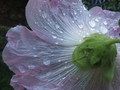
Subtle Beauty at restby
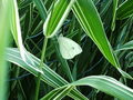
geekssweetComment by levyj413: I would've voted this a 4. Now as to why ...
The butterfly isn't too sharp. That'll almost always knock a point of of my vote. Were you using your camera's macro mode? If it has one, that will let you get much closer to things and still get sharp photos.
The composition is very centered. When you're zoomed in on something, that can work well, but this isn't. It's usually more interesting to have the subject off-center. Look up "rule of thirds" on Google for ample references. It's not a 100% thing, but it's a good place to start.
Also, with closeups, you're often better off filling as much of the frame as possible with the subject.
The multiple grass blades distract from the butterfly. You've got a natural frame around it, but the stuff outside that just carries my eye away.
Combining cropping tighter, using the natural frames of the blades, and moving at least the body off-center, here's an alternative:

The next issue is contrast. Often images right out of the camera are low in contrast, so the colors are kind of dull. It looks like there's a layer of gray over the whole thing. That's not your fault; it's related to how digital cameras work. Even with a minimum of post-processing knowledge, though, you can make some improvements. Here's what I got simply by playing around with the brightness and contrast sliders. You usually need to reduce brightness and you increase contrast to keep the whites from being "blown out" meaning they lose all detail.

See how that makes the butterfly stand out against the background?
I'm starting with the low-resolution image, so these aren't fantastic, and I'm not saying that my alternatives are going to win ribbons. But I hope they give you some ideas. Cropping for composition and enhancing contrast are steps I take on almost every image.
You can also search Google for "photoshop curves" and "photoshop levels" to find good tutorials on those. They're better tools than the contrast slider.
I hope this is helpful!