Old Fashioned Portraitby
beautyqn25Comment by Matthew: Hello from the Critique Club!
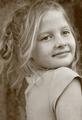
This is a nice image, with a very obvious grain. I like the look that you have chosen: the slightly sepia effect does age the image, though at the expense of achieving strong tonal range throughout the image. By this I mean that the blacks are not very black, and the whites are not very white. Having said that, the whole image is well exposed, and there are stronger blacks on some points of detail (eyes, mouth). I might be tempted to experiment with pushing the contrast a little higher.
Your subject has a very pretty expression and warmth about her. Great pose, with an obvious tension in the way you have framed her that elevates the image beyond a snap. Her t-shirt does not fit perfectly within the idea of an aged picture, as it is an anachronism! I would not recommend period dress (a little hackneyed), but perhaps something a little more timeless.
The Depth of Field that you have chosen has left your subject's left eye slightly out of focus. However, her shoulder is in focus. This makes me think that you might have needed to be a fraction further forwards at the focal length used, to move her face into focus at the expense of the less important shoulder. This is a minor criticism: you have, in any case, kept the eye nearer the viewer in focus and that is the more important of the two.
Great photo. Good luck with the next challenge!