| Image |
Comment |
| 05/15/2006 11:20:06 PM |
|
| 05/14/2006 04:57:30 PM |
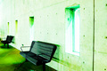
desolateby zoshyiiComment by hideout: I like the unconventional coloring of this image. Maybe cropped a bit tight on the bottom of the bench but I like the minimalism here. |
| 05/13/2006 04:59:07 AM |
|
| 05/13/2006 12:10:53 AM |
desolateby zoshyiiComment by Rebecca: I don't think a lot of voters are going to like this, but I kinda do. I would like to see the green saturation turned down a bit, though. It's actually a little too bright, almost difficult to look at. Emphasize the grunginess. |
| 05/11/2006 08:15:04 PM |
desolateby zoshyiiComment by digitaldave: The greenish light, along with the subject matter does a good job of communicating a stark, desolate setting. Interesting shot. |
| 05/11/2006 06:18:02 PM |
|
| 05/11/2006 11:58:21 AM |
|
| 05/11/2006 10:11:06 AM |
|
| 05/11/2006 02:34:56 AM |
|
| 05/10/2006 11:56:53 PM |
desolateby zoshyiiComment by spistole: This is really overblown, but I love how it works with the mood you're conveying. Whether or not that was an accident, I think it fits. |
Home -
Challenges -
Community -
League -
Photos -
Cameras -
Lenses -
Learn -
Help -
Terms of Use -
Privacy -
Top ^
DPChallenge, and website content and design, Copyright © 2001-2026 Challenging Technologies, LLC.
All digital photo copyrights belong to the photographers and may not be used without permission.
Current Server Time: 07/15/2026 01:28:59 PM EDT.