| Image |
Comment |
| 04/27/2005 07:28:53 PM |
Last Waveby RickHComment by ralph: the wave ? the surfer? the other people in the water ?
the wave if it is minimalalist dwarfs the surfer ... |
 Photographer found comment helpful. Photographer found comment helpful. |
| 04/27/2005 06:53:37 AM |
Last Waveby RickHComment by Falc: Shme you kept the skyline and that there are other surfers in shot, could have been excellent |
| Photographer found comment helpful. |
| 04/18/2005 07:44:26 PM |
|
| Photographer found comment helpful. |
| 04/18/2005 01:33:34 PM |
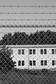
Closed Military Baseby RickHComment by Brad: Image seems more about the fencing than the building. Perhaps a little less depth of field to have blurred the fencing would have put the focal point on the building more. |
| Photographer found comment helpful. |
| 04/13/2005 03:37:06 PM |
Closed Military Baseby RickHComment by e301: There are certain graphic elements tto this that i really like - the contrast of the barbed wire and the fence, the lines of the wire and the lines of the windows, and the block areas of subject. it must be said that it doesn't speak immediately of abandonment (and in a challenge with so many entries, many voters might be looking for any reason to put an image out of contention). For me, it lacks a sense of detail, of anything beyond that purely grahic quality. |
| Photographer found comment helpful. |
| 04/13/2005 08:11:07 AM |
|
| Photographer found comment helpful. |
| 04/09/2005 10:18:37 PM |
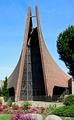
Holy, Holy, Holyby RickHComment by jfaulkner: Excellent. You could loose the forground and still have a great shot. Right on topic, well focused and the light is good. 8 |
| Photographer found comment helpful. |
| 04/06/2005 04:56:28 PM |
Holy, Holy, Holyby RickHComment by saracat: I like the concept. Wish it was a little more centered. Light is a little harsh, and it all seems just a little bit out of focus. |
| Photographer found comment helpful. |
| 04/06/2005 11:09:55 AM |
|
| Photographer found comment helpful. |
| 04/06/2005 10:35:23 AM |
Holy, Holy, Holyby RickHComment by saiphfire: I like this H, but I think I would have liked it even more if you had been closer to the building and looking up a bit. This would also have made it easier to crop distracting elements out of the picture (e.g. tree) |
| Photographer found comment helpful. |
Home -
Challenges -
Community -
League -
Photos -
Cameras -
Lenses -
Learn -
Help -
Terms of Use -
Privacy -
Top ^
DPChallenge, and website content and design, Copyright © 2001-2026 Challenging Technologies, LLC.
All digital photo copyrights belong to the photographers and may not be used without permission.
Current Server Time: 07/15/2026 03:16:16 PM EDT.