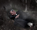
Losing a Soulby
PhotoRynoComment by digitalknight: Greetings from the Critique Club!
This photo shows a lot of thought on your part - and leaves me with a lot of questions - Is this staged? If not did you get to talk with the gentleman? What is some of his "story"?
These kinds of thoughts running through my mind is what draws me to this photo - I love that about good photography, I tend to think about things outside of my day-to-day existence. So you get a big thumbs up from me on that.
Let's talk about some specifics on your work here.
Composition:
I like the composition in general. I'm a big fan of angles, and you have lots of them. The other thing that really strikes me from a composistional angle standpoint is the trees giving us nice vertical lines that really show those angles off. The strong line that the shadow from one pant leg onto the other, the implied line of his back, that nice strong high contrast line between his jacket and his shirt, all give this photo energy.
I also really like the different POV we get here. I don't look at a lot of people sleeping from a couple of feet off the ground - I like that fact that we aren't "looking down" on this man - the feeling that we aren't judging him but are looking at life from his level is very cool.
What would I change about the composition? I would love some of those trees that I waxed so poetic about to be cropped off the top. I think the compositional elements of "vertical" could be accomplished with less tree - and it would strengthen your image. The additional trees just don't add to the "story" your photo is telling, so whack them off!
Lighting:
Hmmm, tough on here. With the processing it's kind of disguised. I like the dingy color scheme over all, and the lighting looks pretty flat like an overcast day. I think that strengthens the message here - the whole "looking at it from his perspective" part of this work.
The main thing I've noticed here - and it think it's part of the processing you did, is the largest white section of your image, the part that draws my eye the most, is a sock! Looks like you might have tried to burn it a little, burn it a LOT! To me it really competes with the face of your subject, the "real" focus of this work. Human eyes are drawn to the highest contrast in your image, and right now that's in the lower right corner.
If it were a perfect world:
Well, perfect according to me. :-)
To me this processing works for an art director working on an editorial piece - but for a photography contest it's too over the top for me. You've crossed into illustration in my opinion.
When I see work like this in a magazine I think "genius", but in a photography contest I always wonder what you are trying to hide (this stems from me "processing to hide" from time to time).
The fractal noise as fog layer is too obvious for my taste. Look at any frame of the new Star Wars films and just marvel at how subtle the effects are. Overall they add to a great illusion (too bad the actors forgot to act, but thats for another critique) but the effects are accomplished by many many very subtle layers, and by using truly organic elements (shooting real fog, real rust, etc) and layering them in there.
DVGarage.com used to have lots of tutorials about this kind of stuff if you are interested - they have changed the web site since I was there last, or I'd give you the direct link. Poke around in there if you think it might be helpful.
I hope I made it clear that I love the look you accomplished - just not for this application.
Great work overall. I hope this has been helpful. Feel free to contact me through the IM system here on DPC with any questions about this critique.
I look forward to seeing more of your excellent work.
Regards,
Doug