| Image |
Comment |
| 09/30/2009 06:30:45 AM |
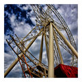
Straight and Levelby vladoComment by Melethia: Kind of a nifty response to the challenge - the shot is competent, but does need a boost in levels. No, seriously, though I just realized that is kinda funny... the light/upper end needs a boost, either via levels (most likely) or brightness contrast. |
 Photographer found comment helpful. Photographer found comment helpful. |
| 09/28/2009 09:09:49 PM |
Sistersby vladoComment by ctownsen357: Meets Challenge - 2
Lighting/Processing - 2
Composition - 1
Overall Impression - 2
"WOW" factor - 1
Score: 8
great job! |
| Photographer found comment helpful. |
| 09/28/2009 02:35:19 PM |
|
| Photographer found comment helpful. |
| 09/27/2009 09:21:00 PM |
Sistersby vladoComment by jomari: Lovely shot. I like the warm monotone - goes well with the warmth of feeling. |
| Photographer found comment helpful. |
| 09/27/2009 08:38:44 AM |
|
| Photographer found comment helpful. |
| 09/27/2009 12:41:40 AM |
|
| Photographer found comment helpful. |
| 09/25/2009 07:44:47 PM |
Deconstructionby vladoComment by JulietNN: Hi from the Critique Club
You asked for a comment from a Critique Club member.
This is the coolest shot. You have the most amazing leading lines, you are crisp, clean and clarity is tremendous. Your HDR here shows people what it can be, not the grainy stuff we are so often confronted with. Your POV is excellent, the half empty shows us what could be, what has been. Your DOF is great, I really feel the height in this shot.
I am not a huge fan of borders, but this suits this shot to a T. I can imagine this on any postcard and selling like hotcakes.
Well done |
| Photographer found comment helpful. |
| 09/23/2009 08:52:20 PM |
|
| Photographer found comment helpful. |
| 09/23/2009 09:40:13 AM |
|
| Photographer found comment helpful. |
| 09/22/2009 11:32:16 PM |
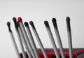
One Of These Is Not Like The Othersby vladoComment by geinafets: I'm sure you cut off the bottom of the image because you are hiding whatever is holding up the matches, but I think the image would be stronger if the match box was more prominent in the frame, both to add some color/take away some of the white and to put the bulk of the detail in the same place. As it is now, my eye wants to bounce between the match heads and the box. |
| Photographer found comment helpful. |
Home -
Challenges -
Community -
League -
Photos -
Cameras -
Lenses -
Learn -
Help -
Terms of Use -
Privacy -
Top ^
DPChallenge, and website content and design, Copyright © 2001-2026 Challenging Technologies, LLC.
All digital photo copyrights belong to the photographers and may not be used without permission.
Current Server Time: 06/19/2026 10:37:01 PM EDT.