| Image |
Comment |
| 04/26/2005 09:09:00 PM |
Smithsby justinbrookComment by neophyte: Nice Job! Fantastic comp and Text Placement. Direct and to the point, no doubt what's being sold. Bottom font color needs to be darker (maybe both) and capiltalized.Good message. |
 Photographer found comment helpful. Photographer found comment helpful. |
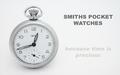
| 04/26/2005 05:25:48 PM |
Smithsby justinbrookComment by bcoble: Too light and blends in with the background. I believe the pocket watch would show itself better if not so light and perhaps a different background color. |
| Photographer found comment helpful. |
| 04/25/2005 08:56:30 PM |
Greenfieldsby justinbrookComment by Gauti: practising for minimalism? good shot, the horizon maybe a fraction lower, the green and blue go well together. |
| Photographer found comment helpful. |
| 04/25/2005 08:01:37 PM |
Smithsby justinbrookComment by Brad: Very clear, simple & uncluttered submission.
Nice job on the lighting here. Only suggestion would be a different font for the main title, such as one that looks similar to the watch face. Good shot regardless. |
| Photographer found comment helpful. |
| 04/25/2005 05:54:51 PM |
Smithsby justinbrookComment by RedOak: Very nice composition. Lighting is simple but efficient. Its nice to see the white background is mastered, with no yellow burns around the shadows. The text is simple and catchy, but suffered because of the image compression (all the curves). Also the second part of the text is kind of odd, as its disapearing, making it harder to read. One suggestion would be to reshoot without hidding the "smiths" on the watch. That's the important part of the watch, which is partially hidden. GW. 8 |
| Photographer found comment helpful. |
| 04/25/2005 04:23:14 PM |
Smithsby justinbrookComment by snackwells: I like the soft lighting and the composition. The lettering is OK, but it appears too sharp (aliased and jagged). |
| Photographer found comment helpful. |
| 04/25/2005 03:36:58 PM |
Smithsby justinbrookComment by Artan: Well taken shot, The clock look very good, the letterring unfortunatly has not sized smoothly.
Adding the text after sizing should cure this ......
|
| Photographer found comment helpful. |
| 04/25/2005 02:51:29 PM |
Greenfieldsby justinbrookComment by Mr_Pants: To me, the horizon looks a little tilted and I feel that perhaps it's a little too centred in the frame. |
| Photographer found comment helpful. |
| 04/25/2005 01:14:14 PM |
|
| Photographer found comment helpful. |
| 04/25/2005 11:22:50 AM |
|
| Photographer found comment helpful. |
Home -
Challenges -
Community -
League -
Photos -
Cameras -
Lenses -
Learn -
Help -
Terms of Use -
Privacy -
Top ^
DPChallenge, and website content and design, Copyright © 2001-2026 Challenging Technologies, LLC.
All digital photo copyrights belong to the photographers and may not be used without permission.
Current Server Time: 07/17/2026 12:41:34 PM EDT.