One Man's Dreamby
mrezaComment by HBunch: *Critique Club*
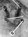
First of all, let me congratulate you on your top scoring photo with this one.
This is a very nice, simple photo.
Very good use of negative space in the upper portion of the photo. You did a very nice job with that. Attention is definately drawn down to the subject.
The background has the appearance of being tilted, however, sometimes it's more of an optical illusion.
The shot does seem a bit grey, maybe a boost of contrast could help that some.
Focus and clarity appear to be right on, and I see nothing that is distracting at all. Which, I think is the point behind being simple and minimalistic.
Lighting looks to be a bit overcast, which could be the reason for the greyness. Or, the greyness could be a reason the photo looks overcast. Eitherway, I think this shot would benefit slightly from some contrast adjustments.
Nice take on the challenge.
~Heather~