| Image |
Comment |
| 03/07/2005 05:09:17 PM |
|
| 03/07/2005 12:10:40 AM |
|
 Photographer found comment helpful. Photographer found comment helpful. |
| 01/29/2005 07:33:29 PM |
|
| 01/29/2005 04:22:02 AM |
...up to threeby jonrComment by aleksi: In the available light this image had too wide dynamic range to be captured. The stairs need badly more detail, while the closer walls start to fade into white. The composition is also a bit off, the number is bit tilted and I'm not sure the image benefits of having slight slide of background world showing from the right of the letter. The idea works well, however, so with retake this might be wonderful on it's own right. |
| Photographer found comment helpful. |
| 01/28/2005 07:26:22 PM |
...up to threeby jonrComment by Falc: Very nice, just a little loss of detail in the darker areas, but nice enough - 7 |
| Photographer found comment helpful. |
| 01/28/2005 06:38:30 PM |
...up to threeby jonrComment by Robro: nice idea but spoiled by the lack of sharpness in the upper steps, the general dirtiness of the building and the distracting glimpse in the top fight hand corner. |
| Photographer found comment helpful. |
| 01/28/2005 07:13:20 AM |
...up to threeby jonrComment by aznym: I like it. I think it would have been better if you has stepped a tad bit to the right so that you don't see that little gap up there. Now the eye becomes curious and moves away from the 3. But I definitely like this shot much better than all the 3 objects with a white or black background. |
| Photographer found comment helpful. |
| 11/07/2004 08:35:34 PM |
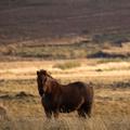
Oneby jonrComment by cghubbell: Feels off-balance to me... A bit top-heavy. I think a bit of fill flash from the phtog's right side would help to bring out more detail in the subject's coat. |
| Photographer found comment helpful. |
| 11/07/2004 05:52:23 PM |
|
| 11/07/2004 12:33:14 AM |
Oneby jonrComment by train: beautiful image of a horse but the background would look better if it was cropped
half way the background is just taking away from the fabulous horse |
Home -
Challenges -
Community -
League -
Photos -
Cameras -
Lenses -
Learn -
Help -
Terms of Use -
Privacy -
Top ^
DPChallenge, and website content and design, Copyright © 2001-2026 Challenging Technologies, LLC.
All digital photo copyrights belong to the photographers and may not be used without permission.
Current Server Time: 07/18/2026 06:46:35 AM EDT.