| Image |
Comment |
| 09/14/2009 12:59:46 AM |
|
 Photographer found comment helpful. Photographer found comment helpful. |
| 09/09/2009 09:19:07 AM |
|
| Photographer found comment helpful. |
| 09/05/2009 06:34:07 PM |
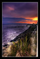
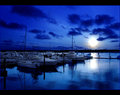
Tides of Dawnby RulerZigzagComment by rooum: Great colours. Could do with some foreground in the shot maybe. Get down there and get your feet wet! :) |
| Photographer found comment helpful. |
| 09/04/2009 09:36:07 AM |
|
| Photographer found comment helpful. |
| 09/02/2009 11:11:42 PM |
|
| Photographer found comment helpful. |
| 08/30/2009 10:46:27 PM |
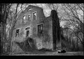
Cataclysm: The Wrath of Natureby RulerZigzagComment by Ja-9: you have an amazing portfolio...one thing that I really like is that you put where you took your pictures...this shot is absolutely stunning...I love the angle, texture and how abandoned the building is...excellent ... well obviously I really, really like this... |
| Photographer found comment helpful. |
| 08/25/2009 01:54:23 PM |
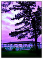
Twilight Plazaby RulerZigzagComment by Ja-9: tried not to read the other comment but...IMO I not as big of a fan of the sky...it looks to fake (would like to see the original if possible..) but I do like the color and tone of the shelter and the grass... |
| Photographer found comment helpful. |
| 08/14/2009 09:24:44 AM |
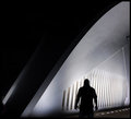
The Pearly White Gateby RulerZigzagComment by salmiakki: Greetings from the Critique Club
Interesting image, I could imagine seeing it as a book jacket for a murder mystery book.
I like how even though it's a colour image, it looks like a black and white. The composition is good, I am a fan of negative space, although I perhaps would have liked the lone figure to be a bit further to the right, but that's a miniscule nit pick and simply my personal preference. I like the silhouetted figure with the strong backlighting, it's very effective. Also the complete darkness adds to the sense of mystery.
Tying to analyse why this did not score higher is difficult, I think it's a well composed interesting image, but I suppose it perhaps lacks the WOW factor that is typically associated with DPC free study challenges. I would have expected it to be more like 6.0.
|
| Photographer found comment helpful. |
| 08/07/2009 08:37:16 AM |
|
| Photographer found comment helpful. |
| 08/05/2009 07:01:52 PM |
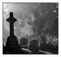
Into the Lightby RulerZigzagComment by timfythetoo: Greetings from the Critique Club -
I will start off with the fact that I gave this a 7 - which in a dismal challenge was one of my higher votes. I like the graininess, I like the varied levels of shadow going back. I may have punched it even darker making the front stone almost a true silhouette. It doesnt have anything really standing out to say "WOW" but I felt it stood out well in the challenge.
My biggest issue is the border. You have this dark gloomy image wrapped in a bright white border. I would have probably gone with a black border or no border at all. It is just an odd combo in my eyes.
I figured this would have placed higher. Whatcha gonna do.
Tim |
| Photographer found comment helpful. |
Home -
Challenges -
Community -
League -
Photos -
Cameras -
Lenses -
Learn -
Help -
Terms of Use -
Privacy -
Top ^
DPChallenge, and website content and design, Copyright © 2001-2026 Challenging Technologies, LLC.
All digital photo copyrights belong to the photographers and may not be used without permission.
Current Server Time: 06/21/2026 07:48:47 PM EDT.