| Image |
Comment |
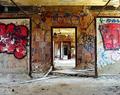
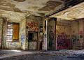
| 09/09/2005 12:08:17 PM |
Echosby RulerZigzagComment by Tuckersmom: This is one of my favorites in your portfolio. I love the colors and think the centered composition works in this case. Great depth of field and so much to look at but not overwhelming. I like how the red graffiti is on each side of the doorway giving it a sense of balance. Only one small idea would be to crop a little off the bottom to get rid of that black thing in the lower left corner. Great shot :) |
 Photographer found comment helpful. Photographer found comment helpful. |
| 09/09/2005 11:44:06 AM |
Taking the Sunby RulerZigzagComment by Tuckersmom: This is so cute - really captures the dog's personality I think. Looks like she/he's ready to play :) The only thing I find distracting is that one thread hanging down. |
| Photographer found comment helpful. |
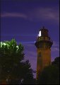
| 09/09/2005 10:40:56 AM |
Nightlightby RulerZigzagComment by pgatt: This is nice, love the contrast in shadow and light and between colours here, the colour of the tower makes the shot, the purple/blue sky comes a close second. |
| Photographer found comment helpful. |
| 09/09/2005 10:30:05 AM |
Nightlightby RulerZigzagComment by ajschel: Beautiful colours, great capture! The white top of the trees distracts since it is not in sync with the overall gloomy lighting of the photo. Love the colour of the sky and the stars in it. Nice achievement. |
| Photographer found comment helpful. |
| 09/09/2005 10:25:46 AM |
Nightlightby RulerZigzagComment by armelle: Just a tad more cropping and a bit of straightening... I like the captured light beam and the composition. Maybe increasing the contrast to better see the stars with a darker sky? Knowing my bad tendencies, I would try to dodge and burn the sky just a tad to add highlight to the clouds and the beam of light. well done! |
| Photographer found comment helpful. |
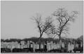
| 09/09/2005 10:20:30 AM |
Life among the dead.by RulerZigzagComment by armelle: Nice capture and good composition. I wonder how it would look with a whiter sky to increase the contrast with the trees? Maybe a bit of dodge and burning to add some light on the headstones and darken the back bushes? But good idea for a photo and well executed! |
| Photographer found comment helpful. |
| 09/09/2005 10:16:10 AM |
DSC00038.JPGby RulerZigzagComment by armelle: Nice photo. I like the gate cloth blowing in the wind and the perspective of the people walking through it! The cropping could have been made to right the gate straight with the frame IMHO! And I do wonder how selective desaturation might have looked with all B&W except for the gates? The cheery baby blue sky somehow takes away from the feel of this photo. Great capture and composition! |
| Photographer found comment helpful. |
| 09/09/2005 09:01:59 AM |
|
| Photographer found comment helpful. |
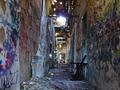
| 09/09/2005 09:01:26 AM |
Seeping Lightby RulerZigzagComment by Jutilda: This is awesome. I love the perspective. The vivid colors of the graffiti are wonderful. This is a great shot!! Very well done. |
| Photographer found comment helpful. |
| 09/09/2005 09:00:56 AM |
|
| Photographer found comment helpful. |
Home -
Challenges -
Community -
League -
Photos -
Cameras -
Lenses -
Learn -
Help -
Terms of Use -
Privacy -
Top ^
DPChallenge, and website content and design, Copyright © 2001-2026 Challenging Technologies, LLC.
All digital photo copyrights belong to the photographers and may not be used without permission.
Current Server Time: 06/23/2026 01:00:40 PM EDT.