| Image |
Comment |
| 01/16/2006 05:19:19 PM |
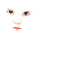
Niveusby conglettComment by kearock: I honestly don't find this sort of extreme high key all that appealing, particularly for a human subject. I also don't like some of the yellowish orange tones that are left, particularly below the lips. It's a brave entry, good luck! |
 Photographer found comment helpful. Photographer found comment helpful. |
| 01/16/2006 01:00:01 PM |
Niveusby conglettComment by SandyP: This is so interesting. I find myself wanting to keep looking at it. Very artistic and beautiful. |
| Photographer found comment helpful. |
| 01/16/2006 09:31:22 AM |
|
| Photographer found comment helpful. |
| 01/16/2006 05:27:28 AM |
Niveusby conglettComment by sherpet: Wow, this make such a very strong impact/statement. For so little, it certainly packs a punch..... Nice one. |
| Photographer found comment helpful. |
| 01/16/2006 02:00:11 AM |
Niveusby conglettComment by Jutilda: AWESOME!!!!! Love the alabaster filter. This is really angelic in a creepy way. LOL 8 (it's "niveous") |
| Photographer found comment helpful. |
| 12/28/2005 06:44:55 AM |
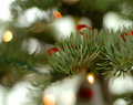
Noelby conglettComment by macrothing: 6 - Very nice. Background/DOF/bokeh is very complementary. Criticism; having said that, the dark green 'line' on the left, which I presume is the lighting cord/cable, detracts, but fairly minor. Like to see that 'stem/branch/needles' enhanced, 'somehow', just a bit more, making it really 'pop' and dominate. Perhaps a slight crop adjustment too, mainly at the top/bottom, trying to not 'cut' any 'circles' too much, may have also made this better in my opinion. Good potential here and nice and simple, including the colors. |
| Photographer found comment helpful. |
| 12/27/2005 03:12:43 PM |
|
| Photographer found comment helpful. |
| 12/23/2005 03:20:40 PM |
Noelby conglettComment by Mick: Love the bokeh and the sharpness of the needles. I think it needs something more to make it really stand out though. |
| Photographer found comment helpful. |
| 12/21/2005 01:56:10 PM |
Noelby conglettComment by theSaj: nothing to really "grab" me here....if there was an ornament, bulb, anything. It's like "interesting background" but no main element.
|
| Photographer found comment helpful. |
| 12/17/2005 03:00:52 PM |
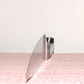
Friendsby conglettComment by gaurawa: ** Critique club **
first impression: oh cool !! the knife almost looks transparent. Great angle selection.
A few things I think could be improved are; first the sharp reflected light from knife on the paper just on the right. If you used a more diffused light, this can be avoided and will help the knife look more transparent.
the background seems to have some red, a whiter background could add more ot the image.. a white paper used as background may provide you better results.
If you have any questions, feel free to pm me
-gaurawa
|
| Photographer found comment helpful. |
Home -
Challenges -
Community -
League -
Photos -
Cameras -
Lenses -
Learn -
Help -
Terms of Use -
Privacy -
Top ^
DPChallenge, and website content and design, Copyright © 2001-2026 Challenging Technologies, LLC.
All digital photo copyrights belong to the photographers and may not be used without permission.
Current Server Time: 07/16/2026 05:53:23 PM EDT.