| Image |
Comment |
| 03/29/2005 10:19:19 AM |
|
 Photographer found comment helpful. Photographer found comment helpful. |
| 03/29/2005 09:14:32 AM |
|
| Photographer found comment helpful. |
| 03/29/2005 07:37:41 AM |
On my ownby joaquinComment by rex: I am making two passes on this Challenge. I will vote on your photo then return later(before voting is over) to comment on what I like and dislike about your shot. You can take the comments however you wish and I will try not to be mean. Just don't take it the wrong way.
--------------------------------------------------------------------------------------------------------------
Nice. The only thing is the shadow on the wall distracts me. |
| Photographer found comment helpful. |
| 03/29/2005 04:48:30 AM |
On my ownby joaquinComment by sammy_stecchino: Could have done better with the composition. Such as instead of the wasted space on the left and right and only partial view of the headstone with th writing at the botto, could have turned the camera and shown what the statue was mourning over. I really like it though. |
| Photographer found comment helpful. |
| 03/28/2005 10:42:12 PM |
On my ownby joaquinComment by khrys: I'm still just a rank amateur, but I would have loved to have seen this with the full epitaph and a little more to the right, perhaps. Lovely capture of the shadow with the arms of the statue. |
| Photographer found comment helpful. |
| 03/28/2005 10:41:44 PM |
|
| Photographer found comment helpful. |
| 03/20/2005 05:22:45 PM |
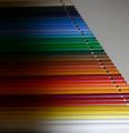
Color of linesby joaquinComment by michael_p: Slightly too much shadow to the left hand side and I would have prefered a focus at the front receeding backwards but a good entry anyhow |
| Photographer found comment helpful. |
| 03/18/2005 08:21:08 AM |
Color of linesby joaquinComment by strangeghost: This is a wonderful idea but I think the execution could have been improved. The lighting is too irregular and the large shadowy areas on the left detract from the regular, patterned appearance. The dof is a little too shallow too. I think you might have zoomed in closer, fewer pencils (or whatever) and brought out more detail and sharpness. Together with more uniform lighting, it could've been a visually arresting photo. As is, it's interesting, but not quite there... |
| Photographer found comment helpful. |
| 03/17/2005 11:01:42 PM |
Color of linesby joaquinComment by Tuckersmom: This is a good idea, but unfortunately it is not real sharp and I think an image like this needs to be tack sharp. A different perspective that would eliminate the right hand background would be more interesting. |
| Photographer found comment helpful. |
| 03/15/2005 11:01:52 PM |
|
| Photographer found comment helpful. |
Home -
Challenges -
Community -
League -
Photos -
Cameras -
Lenses -
Learn -
Help -
Terms of Use -
Privacy -
Top ^
DPChallenge, and website content and design, Copyright © 2001-2026 Challenging Technologies, LLC.
All digital photo copyrights belong to the photographers and may not be used without permission.
Current Server Time: 07/16/2026 10:46:30 PM EDT.