| Image |
Comment |
| 12/02/2009 09:02:32 PM |
|
 Photographer found comment helpful. Photographer found comment helpful. |
| 12/02/2009 12:25:56 PM |
Centuries Oldby GeorgeComment by Dr.Confuser: Your choice of lighting and processing emphasize nicely the massiveness and the delicate details of the church. I like the contrast in the subject and in the photo. |
| Photographer found comment helpful. |
| 12/02/2009 11:55:46 AM |
Centuries Oldby GeorgeComment by Ja-9: beautiful church...IMO adding a gradient could have helped to richen up your tones just a bit |
| Photographer found comment helpful. |
| 11/23/2009 09:09:53 AM |
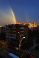
Urban Rainbowby GeorgeComment by phase3: I like the whole photo. It's natural. They asked for a rainbow, you gave them two.
I gave you a 7
Meets the challenge in every way. Nice photo.
:) |
| Photographer found comment helpful. |
| 11/22/2009 11:57:08 PM |
|
| Photographer found comment helpful. |
| 11/20/2009 06:44:58 PM |
5by GeorgeComment by Mephisto: care to share some info on this one? (format, camera, camera settings, film type,...?)
the clarity on your film images, especially on this one, is amazing and reminds me on medium or large format prints.
very good work! |
| Photographer found comment helpful. |
| 11/18/2009 01:35:56 AM |
|
| Photographer found comment helpful. |
| 11/17/2009 12:34:56 PM |
|
| Photographer found comment helpful. |
| 11/17/2009 02:51:11 AM |
Urban Rainbowby GeorgeComment by GiorgioBaruffi: i like natural raimbow here, but i do not like so much the noise elements in the foreground, I'd chose a long focal to isolate the rainbow. |
| Photographer found comment helpful. |
| 11/16/2009 08:20:44 PM |
Dualityby GeorgeComment by geinafets: I'm curious as to why you lit the face from underneath. "Monster lighting" (as it's called when you do that) is not very flattering on anyone. |
| Photographer found comment helpful. |
Home -
Challenges -
Community -
League -
Photos -
Cameras -
Lenses -
Learn -
Help -
Terms of Use -
Privacy -
Top ^
DPChallenge, and website content and design, Copyright © 2001-2026 Challenging Technologies, LLC.
All digital photo copyrights belong to the photographers and may not be used without permission.
Current Server Time: 07/15/2026 07:13:54 PM EDT.