So, that's a bird?by
XileboComment by CEJ: Hello from the Critique Club!
I have studied your image and have the following to offer:
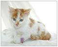
Composition/perspective - you have kept the focus of your subject out of the center - good application of the rule of thirds. Being on eye level with your subject is a big plus in my opinion. The crop works well here keeping the negative space to a minimum while allowing the subject to fit in the frame. The expression is priceless and I think coupled with your title, lets the prop bird fit in nicely. The small bits of color the prop add to (purple and red) and don't hurt the image. Their contribution is insignificant compared to the image as a whole. The image is crisp and clean, well focused and not overdone. Perhaps the sheet/cloth that is draped could occupy more space to the right (that area appears a bit bright) to help tone that area down a bit - the brightest part of the image.
Lighting - it appears as though multiple light sources were used - background and foregound. Nice balance. Although the upper right corner - the negative space - appears somewhat bright, it is not blown out and distracting. The detail in the cat is clear and consistent and there are no bright spots or flares anywhere. Well done!
Color - the colors, although minimal, in this shot are really nice. There is just enough to keep it from being a boring white picture but not too much that makes you wonder why it was submitted. There is enough white from the cat in contact with the white background to keep the cat inline with the theme, but separate it from the background so it is not lost. Excellent mix...an aspect that was enhanced by your control of the lighting.
Challenge requirements - definitely meets the challenge requirements. Although not totally white, the subject doesn't have to be. The shade of red in the coat is just light enough that it mixes and blends very well. The small amounts of color added by the prop are ok as well. Adds to the direction of focus I think - small enough to be insignificant, yet colorful enough to at least let you notice. Not a distraction at all.
Overall/my opinion - this is an extremely crisp image with a lot of great qualities. Your subject is just cute and very expressive in the face. The sheet/cloth that is draped is an excellent feature. It keeps the background from being flat and absorbing. Perhaps a little wider than just the drape behind the cat - more to the right - but it is not a detractor. Very nice image and very well done!
Message edited by author 2005-11-05 01:01:05.