| Image |
Comment |
| 12/09/2002 09:24:40 AM |
|
| 12/09/2002 07:02:06 AM |
|
| 12/09/2002 12:26:32 AM |
|
| 11/17/2002 06:27:00 PM |
|
| 11/14/2002 10:33:00 PM |
|
| 11/14/2002 01:05:00 PM |
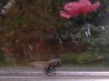
Death Trapby coeurdusucreComment by PTLParsons: Too dark and too much empty space. The streaks on the window draw you attention as well as the red flow at the top. Need to come in on the fly more. It is a good close up of that. Still 6 is not that bad of a score, all considered . PTL |
| 11/14/2002 12:08:00 AM |
|
| 11/13/2002 06:59:00 AM |
Death Trapby coeurdusucreComment by kanid99: Death trap? Is there supposed to be a spider web there? It looks like there may be, but I can't tell. Excellent composition, just needs some work, IMO. |
| 11/12/2002 01:37:00 PM |
Death Trapby coeurdusucreComment by FranziskaLang: ugh, poor thing. challenge -- met. technical -- could you have gotten closer to the fly with your camera or by cropping? if not, fine. if yes, i think it would've benefitted the photo by focusing the viewer more on the fly. composition -- the flower in the background is the brightest bit of color in an otherwise very muted photo, and distracts a lot from your subject. the scratches in the glass do, too, to some degree. -- gr8photos. |
| 11/11/2002 09:53:00 PM |
|
Home -
Challenges -
Community -
League -
Photos -
Cameras -
Lenses -
Learn -
Help -
Terms of Use -
Privacy -
Top ^
DPChallenge, and website content and design, Copyright © 2001-2026 Challenging Technologies, LLC.
All digital photo copyrights belong to the photographers and may not be used without permission.
Current Server Time: 07/16/2026 05:51:03 AM EDT.