| Image |
Comment |
| 07/03/2006 01:39:53 AM |
|
 Photographer found comment helpful. Photographer found comment helpful. |
| 07/03/2006 01:00:50 AM |
|
| Photographer found comment helpful. |
| 07/03/2006 12:30:02 AM |
|
| Photographer found comment helpful. |
| 05/18/2006 03:01:51 AM |
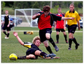
Dirty Physical Contactsby msdoubletroubleComment by DefyTime: :: Critique Club ::
Like I said...good action shot. The colors are vibrant and the DoF is great. For what it is, it is perfect. As far as a good choice for this challenge I would have to say it is more than just a bit of a stretch. This is one of those shots that was taken very well and by itself is a wonderful photo but doesn't fit in this challenge without forcing a title to fit it...and this is not the only image that did so during the challenge. So my only critique is not really about the image or the technical aspect of it, for I know you know how to do it...it is that if you want to score higher that you think about the challenge, get creative and shoot for the challenge...not make a photo you happened to take during the week fit the challenge. (And if you look back at some of my past entries I am guilty of the very same thing sometimes...and have suffered from it also.)
|
| 05/14/2006 11:52:15 PM |
|
| Photographer found comment helpful. |
| 05/12/2006 03:09:39 PM |
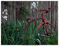
Days Gone Byby msdoubletroubleComment by timfythetoo: Greetings from the Critique CLub -
I think you have an interesting main subject. The tricycle has some good character to it. Unfortunately it seems lost among the irises. I think that a closer cro on the left to get rid of the flowers would have helped bring the focus to the trike. Maybe even a higher angle for the shot instead of looking straight on would have helped as well. I want to see the trike more so than the flowers or the greenery.
From a focus/sharpness point of view there seems to be something funky going on. The picture overall has an odd texture to it (if that makes any sense). Even the blurred background feels off but I dont know why. A slight bump up in saturation, especially on the trike would have been nice I think. Even a bit more on the green as most of the colors seem a bit flat. More light may have taken care of this as well.
THere are alot of different textures, lines and shapes going on. I think the composition is just a bit too busy. Isolating the trike more would have given you a higher score I believe.
You have some nice work in your portfolio and I look froward to seein gmore of your entries inthe future.
Tim |
| Photographer found comment helpful. |
| 05/11/2006 04:57:51 PM |
Dirty Physical Contactsby msdoubletroubleComment by geewhy: Really nice action pic...would look even better had it been in a stadium with a sea of blurred faces in the background rather than parked cars, but that is outwith your control and does not detract from the competence of the photographer.
Well done. |
| Photographer found comment helpful. |
| 05/10/2006 09:25:42 PM |
|
| Photographer found comment helpful. |
| 05/10/2006 03:20:18 PM |
|
| Photographer found comment helpful. |
| 05/09/2006 09:24:53 AM |
|
| Photographer found comment helpful. |
Home -
Challenges -
Community -
League -
Photos -
Cameras -
Lenses -
Learn -
Help -
Terms of Use -
Privacy -
Top ^
DPChallenge, and website content and design, Copyright © 2001-2026 Challenging Technologies, LLC.
All digital photo copyrights belong to the photographers and may not be used without permission.
Current Server Time: 07/18/2026 06:43:48 AM EDT.