| Image |
Comment |
| 04/10/2002 02:35:00 PM |
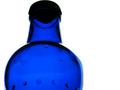
Bottledby mciComment by vin rigby: better composition could have made this one a winner! - needed portrait(tall) image, filling area as much as possible and tilting the bottle top further away. - Colour and exposure superb! |
| 04/10/2002 12:36:00 PM |
Bottledby mciComment by Mousie: Pull back a bit to get the bottle off the top edge of the picture! I love the white, white background, you pulled it off without blowing everything out! |
| 04/10/2002 10:34:00 AM |
Bottledby mciComment by irae: Cool. Maybe good to see a little more room on top, and not quite so much space to the right. I'd have turned the bottle to avoid the code at L. Very nice clarity and color. |
| 04/10/2002 08:10:00 AM |
Bottledby mciComment by Crystal Streams: I love the color.Interesting angle but I would have prefered something a little different |
| 04/09/2002 08:50:00 PM |
|
| 04/09/2002 05:59:00 PM |
|
| 04/09/2002 03:07:00 PM |
Bottledby mciComment by tomlewis1980: This shot just seems to stand out from all the rest, its vivid and simple, fantastic. |
| 04/09/2002 12:23:00 PM |
Bottledby mciComment by ohsmom: this photo needs some kind of a background! You got the curve of the bottle really well but the photo is lacking in substance. |
| 04/09/2002 09:41:00 AM |
|
| 04/09/2002 07:09:00 AM |
|
Home -
Challenges -
Community -
League -
Photos -
Cameras -
Lenses -
Learn -
Help -
Terms of Use -
Privacy -
Top ^
DPChallenge, and website content and design, Copyright © 2001-2026 Challenging Technologies, LLC.
All digital photo copyrights belong to the photographers and may not be used without permission.
Current Server Time: 07/15/2026 11:11:38 PM EDT.