| Image |
Comment |
| 12/05/2005 05:55:43 AM |
|
 Photographer found comment helpful. Photographer found comment helpful. |
| 11/27/2005 01:50:57 PM |
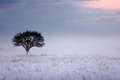
Color of Fogby puzzledComment by UNTITLED: I vote for the color photo. The white and purple tones really create a feeling of cold to go with snowy image. The warm pink tones in the upper corner take away a little bit from the cold feeling of the photo. I think it might look a tad bit better with the large pink area cropped out. That's just being nitpicky, excellent photo regardless. |
| Photographer found comment helpful. |
| 11/26/2005 02:55:38 PM |
|
| Photographer found comment helpful. |
| 11/26/2005 12:02:13 PM |
tree_4052.jpgby puzzledComment by Jutilda: I like this one best. Really fun with the foggy white. Makes the tree truly stand out!!! Nice composition - I love negative space! |
| Photographer found comment helpful. |
| 11/26/2005 11:49:45 AM |
Color of Fogby puzzledComment by saintaugust: the colour version works better for me -- the foreground loses some detail in the b/w transition. also, the mood of the photo is better in colour.
|
| Photographer found comment helpful. |
| 11/26/2005 11:19:06 AM |
|
| Photographer found comment helpful. |
| 11/21/2005 07:05:30 AM |
|
| Photographer found comment helpful. |
| 11/20/2005 05:06:21 PM |
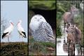
Animals of the Northby puzzledComment by macrothing: 7 - Like this. All very good shots. Criticism; the only real 'criticism' I have had on this triptych (and I've looked at it a few times now) is there seems to be a lack of 'balance', or flow between the three, or their arrangement. Whether it is the colorings, or the 'compositions', I can't decide, but I keep thinking the 'level' (angle?) on 1 & 2 is fairly uniform, the 3rd doesn't 'suit', maybe if it were in the middle, not sure. There are similar colorings in each shot, but obviously blues/whites dominate in 1/2, but then 3 is different and not just because 3 is not 'birds'. Sorry, hard to put into words, but I tried. |
| Photographer found comment helpful. |
| 11/20/2005 04:18:42 PM |
Autumn Roseby puzzledComment by tpoc: The colors are beautiful, and I don't mind the natural business of the photo. That cool pink against the warm tones of the foliage gives enough of a visual jolt that I keep coming back and looking at it. The contrast in color tones makes it feel like a touch of spirng in the fall. I like it.
Jeannel |
| Photographer found comment helpful. |
| 11/20/2005 04:16:22 PM |
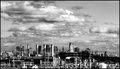
NYC from a bus windowby puzzledComment by tpoc: I remember seeing this when it was uploaded. This is a beautiful b&w image. Love how small the city looks compared to the skyline. The sharpness gives the city an almost surreal feel. Very nicely done!
Jeannel |
| Photographer found comment helpful. |
Home -
Challenges -
Community -
League -
Photos -
Cameras -
Lenses -
Learn -
Help -
Terms of Use -
Privacy -
Top ^
DPChallenge, and website content and design, Copyright © 2001-2026 Challenging Technologies, LLC.
All digital photo copyrights belong to the photographers and may not be used without permission.
Current Server Time: 07/18/2026 01:46:32 AM EDT.