| Image |
Comment |
| 05/08/2006 10:13:02 AM |
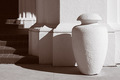
Light and shadowby MelethiaComment by Kelli: Trading post...
I liked this. It's an appealing visual. The shadow play is very nice and consistent. The texture of the post and wall show through very nicely as well. It's the type picture I see hanging in office buildings everywhere. Maybe you should market it! |
 Photographer found comment helpful. Photographer found comment helpful. |
| 05/08/2006 02:38:16 AM |
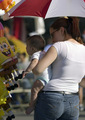
Parade vendors appeal to all agesby MelethiaComment by ericwoo: Nice photo-journalistic capture, but it really lacks any one area of interest. The kid's expression and captivation with the stuffed toy is nice, but he gets lost in the shadow. The cute mom would make an interesting subject, but her face is partially hidden. I agree that this one would also work well in a tabloid-type magazine. Crisp focus and nice exposure with the difficult lighting conditions, but some room for improvement. |
| Photographer found comment helpful. |
| 05/08/2006 02:21:22 AM |
Light and shadowby MelethiaComment by chalice: I like the geometric shapes, the pattern of shadows, and the duotone. Good focus too. Detail in the shadows is good too. Frankly, I don't know what you might do to improve on this, except to try and reduce the blown out light area on the right side of the vase/vessel. I would have scored this a 6 or 7. |
| Photographer found comment helpful. |
| 05/08/2006 02:15:14 AM |
Parade vendors appeal to all agesby MelethiaComment by chalice: I love the subject matter - the baby's reaction to Spongebob is priceless. On the other hand, I'm not sure it fits really well with the "photojournalism" topic, even with a fairly broad definition...unless we include the "neighborhood news" section of the local paper(in which case, almost anything goes).
I like the tight cropping for this picture because a wider picture would probably include a lot of distractions. The blurring of the background also helps focus on the moment and the baby. |
| Photographer found comment helpful. |
| 05/08/2006 02:14:23 AM |
Light and shadowby MelethiaComment by ericwoo: --Trading Post Comment--
Nice capture and nice score. I think that you scored about as high as you could have with this shot and this site. Vivid colors and overdone neat image seem to do better than nice composition and striking contrast. I really like the tonal range that you captured here, as well as the contrast. Beautifly composition and crystal clear focus also work to make this a nice image. The dark and bright areas of the capture also serve to make this a well-balanced image. |
| Photographer found comment helpful. |
| 05/07/2006 09:34:46 PM |
|
| Photographer found comment helpful. |
| 05/07/2006 07:01:36 PM |
|
| Photographer found comment helpful. |
| 05/07/2006 04:04:05 PM |
|
| Photographer found comment helpful. |
| 05/07/2006 01:13:13 PM |
|
| Photographer found comment helpful. |
| 05/07/2006 01:05:56 PM |
Light and shadowby MelethiaComment by KaDi: Lovely quality of line and texture. I like the rhythm of the wall as it echoes the lines in the vase-like object. Interesting abstraction. |
| Photographer found comment helpful. |
Home -
Challenges -
Community -
League -
Photos -
Cameras -
Lenses -
Learn -
Help -
Terms of Use -
Privacy -
Top ^
DPChallenge, and website content and design, Copyright © 2001-2026 Challenging Technologies, LLC.
All digital photo copyrights belong to the photographers and may not be used without permission.
Current Server Time: 06/20/2026 11:53:50 AM EDT.