| Image |
Comment |
| 05/24/2006 09:34:02 PM |
|
 Photographer found comment helpful. Photographer found comment helpful. |
| 05/24/2006 04:32:32 PM |
|
| Photographer found comment helpful. |
| 05/24/2006 08:02:21 AM |
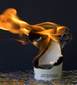
Cannon Coverby MelethiaComment by SandyP: Way to go Deb!!! Top 25. I think this one should have been higher, but not a bad finish! Congratulations!!! |
| Photographer found comment helpful. |
| 05/24/2006 07:52:49 AM |
Cannon Coverby MelethiaComment by aimeethetoo: Nice job Melethia. I intended to comment on this during the challenge but never got back to leaving any comments on Lenscap. This was one of my top picks - really stood out to me - so cool that it was yours. Nice composition, light/shadow, color and emotion. I think it should have scored higher. |
| Photographer found comment helpful. |
| 05/24/2006 03:17:59 AM |
|
| Photographer found comment helpful. |
| 05/24/2006 02:05:26 AM |
|
| Photographer found comment helpful. |
| 05/24/2006 01:59:32 AM |
Cannon Coverby MelethiaComment by thomaspeople: Glad you beat me on this. Very nice shot. I especially like the sky for a background - Sorry I didn't get a comment in during the challenge.
This is very well done, congratulations. |
| Photographer found comment helpful. |
| 05/23/2006 10:31:11 PM |
|
| Photographer found comment helpful. |
| 05/23/2006 09:04:02 PM |
|
| Photographer found comment helpful. |
| 05/23/2006 01:19:34 PM |
|
| Photographer found comment helpful. |
Home -
Challenges -
Community -
League -
Photos -
Cameras -
Lenses -
Learn -
Help -
Terms of Use -
Privacy -
Top ^
DPChallenge, and website content and design, Copyright © 2001-2026 Challenging Technologies, LLC.
All digital photo copyrights belong to the photographers and may not be used without permission.
Current Server Time: 06/21/2026 03:17:18 AM EDT.