| Image |
Comment |
| 07/23/2006 10:25:59 PM |
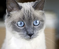
Emma againby MelethiaComment by RKT: What a beautiful cat! I just love siamese cats...excellent conversationalists. |
 Photographer found comment helpful. Photographer found comment helpful. |
| 07/23/2006 10:09:19 PM |
|
| Photographer found comment helpful. |
| 07/23/2006 08:45:18 PM |
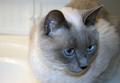
Emmaby MelethiaComment by mk: I actually want to comment on the shot of Emma that you have as your profile pic but don't see a full version in your portfolio. I love that shot! She is such a beautiful cat! |
| Photographer found comment helpful. |
| 07/23/2006 08:17:17 PM |
|
| Photographer found comment helpful. |
| 07/21/2006 02:57:37 PM |
|
| Photographer found comment helpful. |
| 07/21/2006 01:36:33 PM |
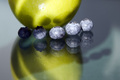
Quiet Progressionby MelethiaComment by Louis: Very pretty and understated, the best kind of photograph. The bokeh is very cool; the contrast between the vine and the metal wire is excellent. |
| Photographer found comment helpful. |
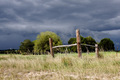
| 07/21/2006 01:34:05 PM |
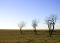
Corner postsby MelethiaComment by Louis: Nice photo; I like the contrast between the brooding overcast sky and the lighter, almost serene grass and stationary fenceposts. The clouds are great. Position of the posts in frame is good, and nice the way the image sweeps away to the left, drawing the eye into the background there. |
| Photographer found comment helpful. |
| 07/20/2006 12:44:12 PM |
|
| Photographer found comment helpful. |
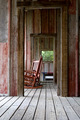
| 07/20/2006 11:24:15 AM |
Relaxing Linesby MelethiaComment by dreamy: nice picture
the chair is in a disturbing place of the picture
Maybe centered between the 2 doors should have been better? |
| Photographer found comment helpful. |
| 07/20/2006 07:08:12 AM |
|
| Photographer found comment helpful. |
Home -
Challenges -
Community -
League -
Photos -
Cameras -
Lenses -
Learn -
Help -
Terms of Use -
Privacy -
Top ^
DPChallenge, and website content and design, Copyright © 2001-2026 Challenging Technologies, LLC.
All digital photo copyrights belong to the photographers and may not be used without permission.
Current Server Time: 06/22/2026 09:15:37 PM EDT.