| Image |
Comment |
| 08/09/2008 02:37:58 PM |
|
 Photographer found comment helpful. Photographer found comment helpful. |
| 08/09/2008 10:24:51 AM |
|
| Photographer found comment helpful. |
| 08/09/2008 09:50:24 AM |
|
| Photographer found comment helpful. |
| 08/09/2008 09:24:42 AM |
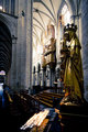
St Michaels statueby MelethiaComment by colorcarnival: Ooooh - the thumbnail sucked me in on this one. Gorgeous! I love the gold against the cool toned background. Also it's like an optical illusion back there with the pillars kind of obstructing the depth of the area lit on the right. It's like - does it continue or not? Really beautiful composition. |
| Photographer found comment helpful. |
| 08/08/2008 11:56:57 PM |
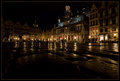
Godiva Darkby MelethiaComment by levyj413: Oh, another Deb special: taking the mundane and somehow, once again, pulling out art. I chuckled to read most people walked behind you when they saw your camera. I've had the same problem. I want to yell "NO! I WANT you in the frame. Just pretend I'm not here!" The randomness of it is part of the fun, to see what comes along.
Anyway, back to your shot, I love how your title reflects not only the product in the window but also the generally dark scene. |
| Photographer found comment helpful. |
| 08/08/2008 08:00:16 PM |
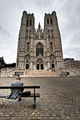
Bench With a Viewby MelethiaComment by levyj413: Deb, I think this is terrific. I much prefer this over both alternative edits. Your composition, esp, catching the guy, is just spot-on.
Where it falls a little short for me is the sky, but even more the darkened tops of the towers. Tone mapping can darken areas it shouldn't, so I'd try it with two layers: tone map one, but then mask it so only the sky portion is showing, leaving the church fully bright. That'll help it stand out against the stormy sky.
That'd also free you to darken the sky a bit. Not a lot, and not as much as your alt. edit, but a bit. And I'd try just darkening it and increasing the contrast, not higher levels of tone mapping, to avoid the "halo" that appears near the church in the alt. edit.
But all of that is to suggest minor edits to a great shot. |
| Photographer found comment helpful. |
| 08/08/2008 06:38:14 PM |
|
| Photographer found comment helpful. |
| 08/08/2008 06:20:34 PM |
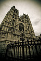
July FS alt editby MelethiaComment by ELLIPS: Hi Melethia,
Globally more attractive shot than the first edit, the light emphasizes the bench here.
I don't think you could do better with a single shot and the Brussel's sky :)
With several exposures blended in Photomatix or PS, something more dramatic was probably possible.
I really enjoyed some of the Brussel's shot (and others...) in your portfolio.
Best Regards,
Michel
|
| Photographer found comment helpful. |
| 08/08/2008 03:46:46 PM |
Bench With a Viewby MelethiaComment by Jedusi: Hey Deb - nice shot - see what I mean about commenters scores and non-commenters ? The ones who say it should do well generally mean it and score it accordingly . .
Anyway - the only thing I would have changed is the title, maybe to something like 'Contemplation' as he is sitting in front of a church with his head apparently bowed.
While you are right that this is a 'Bench with a view' the human element is not actually carrying out the suggestion in the title, which creates a slight distraction for me.
That aside - the both the technical composition, and included elements are very good - and as for the weather, or dramatic clouds - pfff - what can you do ? |
| Photographer found comment helpful. |
| 08/08/2008 01:33:24 PM |
|
| Photographer found comment helpful. |
Home -
Challenges -
Community -
League -
Photos -
Cameras -
Lenses -
Learn -
Help -
Terms of Use -
Privacy -
Top ^
DPChallenge, and website content and design, Copyright © 2001-2026 Challenging Technologies, LLC.
All digital photo copyrights belong to the photographers and may not be used without permission.
Current Server Time: 08/24/2026 07:35:11 PM EDT.