| Image |
Comment |
| 06/17/2007 12:39:13 PM |
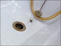
Pure TERRORby fredandaudComment by btrfly: holy moly! that looks like a very large spider... assuming it is real, nice capture of the challenge - pure! |
| 06/16/2007 07:03:18 PM |
Pure TERRORby fredandaudComment by jonfrommk: A very good and humorous image that meets the challenge well. However, in my (limited) experience. Humour does not do very well in DPC unless executed to perfection (I say this from my own experience) and you may well suffer in terms of voting because of some very minor issues that would probably be overlooked in a more conservative shot. The plug, plughole and shower tubing all help to give the image excellent context, but small things such as the shadows, the hot spots from the reflection of the light and even possibly the fact that the plughole does not glisten like a new penny will probably cost you votes. Possibly could have even done with slightly more zoom (or cropping) to focus solely on the plug spider etc and reduction of the bath itself.
From my own perspective I like this image a lot and have scored it 8, however the ideas I have suggested (yet often fail to execute myself) would I believe see this move from what I am guessing would be a 5 score to a 6+
Hope this comment does not seem too self important/indulgent its simply made because I love this type of picture and would love to see it front page come rollover day
Jon |
 Photographer found comment helpful. Photographer found comment helpful. |
| 06/16/2007 02:28:12 AM |
|
| 06/14/2007 07:13:42 PM |
|
| 06/14/2007 01:28:08 PM |
|
| 06/14/2007 04:59:33 AM |
Pure TERRORby fredandaudComment by Marc923: I feel for ya. Those little buggers can be quite terrifying. A closer crop on the spider would make this more interesting. |
| 06/14/2007 02:26:55 AM |
|
| 05/29/2007 04:54:08 PM |
Who's a pretty buoy ?by fredandaudComment by quiche: Great title. Like the shot, especially the strong primary colors and the clouds. Don't like the border. It distracts from an otherwise good shot. |
| 05/27/2007 02:53:45 PM |
Who's a pretty buoy ?by fredandaudComment by JuliBoc: Don't like the border, but not subtracting for that. I think simple black would have been effective and wouldn't have competed with the image for attention. |
| 05/26/2007 01:55:46 AM |
Who's a pretty buoy ?by fredandaudComment by emlbaker: I think that your choice of border has detracted from the overall feel of this image. I like thimage and think that it is well constructed, but the border does not fit. |
Home -
Challenges -
Community -
League -
Photos -
Cameras -
Lenses -
Learn -
Help -
Terms of Use -
Privacy -
Top ^
DPChallenge, and website content and design, Copyright © 2001-2026 Challenging Technologies, LLC.
All digital photo copyrights belong to the photographers and may not be used without permission.
Current Server Time: 07/16/2026 02:23:32 AM EDT.