| Image |
Comment |
| 08/12/2004 11:07:35 AM |
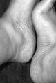
Hand on my heartby KaveyComment by Kavey: Was chatting to someone about this image today and their comment below about it not being my heart. This was my response, which I thought might be nice to also add here.
It IS the wrong side to be my heart... but it was a figurative title for me so I decided to go with it. "Hand on my heart" is often said to convey truthfulness about the statement it accompanies and that's what I was going for. |
| 08/10/2004 05:04:43 PM |
Sby KaveyComment by Jacko: I like the way it flows, however I feel the lighting a bit too harsh. The feet look too shiny. I bet the owner of the feet is a cutie though :) |
 Photographer found comment helpful. Photographer found comment helpful. |
| 08/10/2004 04:52:02 PM |
Sby KaveyComment by jmsetzler: This is a challenging composition. I definitely understand the theme and your intent with this photo, but something is causing me to struggle with it. It may possibly be the exclusion of the toes on the right foot. Something just doesn't 'flow' and I can't really put my finger on exactly what it is. It may simply be that the S is not strong enough to successfully create the flow. Another possible modification to increase the strength of the curves here would have been to let them create a little stronger diagonal in the frame by rotating the camera slightly counter clockwise for the photo. I can't really 'recreate' this image a different way in my mind without actually trying it :)
|
| Photographer found comment helpful. |
| 08/10/2004 04:26:12 PM |
Sby KaveyComment by crabappl3: There is nothing that grabs me in the shot. Looks like a quick snap while sitting on your bed. The lines are ok, but again, just kinda luke warm about it. |
| Photographer found comment helpful. |
| 08/10/2004 04:25:47 PM |
Sby KaveyComment by frisca: you will probably laugh when I say this, but I think a tigher crop would have helped -- take off the left leg/ankle to really bring the attention to the shape of the feet. I also think I would have liked to see a bit more toe (voyeur in me I'm sure) I like that this is in BW, and the tones are good. Ideally, I would have preferred a little more contrast or something to make it more dramatic. |
| Photographer found comment helpful. |
| 08/10/2004 11:54:28 AM |
Sby KaveyComment by JBjb: Almost a yin,yang. Increasing the bright / dark contrast a little would inhance the design aspect, I think, as would muting the sharpness of the detail. NIce picture! |
| Photographer found comment helpful. |
| 08/10/2004 07:08:28 AM |
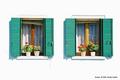
Two Shuttered Windowsby KaveyComment by geewhy: There`s not a lot that can beat the contrasts in colour highlighted by the mediterranean sun on whitewash walls.
This is a real beauty Kavey and it has me wishing I was over there now. |
| Photographer found comment helpful. |
| 08/09/2004 06:57:56 PM |
Sby KaveyComment by singale: great shot , good composition, great colors |
| Photographer found comment helpful. |
| 08/09/2004 03:48:50 PM |
Sby KaveyComment by dcano: I think that with a tighter crop so that you did not see the heals would have really made this a contender for me. A few bright spots but not distractingly overexposed. As it is it is still a good shot. |
| Photographer found comment helpful. |
| 08/09/2004 03:47:54 PM |
Sby KaveyComment by Loki: Are those your feet? I can just picture you trying to take this photo, putting your feet together in this interesting position, and then trying to frame them up just right. I like the composition you have, and the contrast is nice. |
| Photographer found comment helpful. |
Home -
Challenges -
Community -
League -
Photos -
Cameras -
Lenses -
Learn -
Help -
Terms of Use -
Privacy -
Top ^
DPChallenge, and website content and design, Copyright © 2001-2026 Challenging Technologies, LLC.
All digital photo copyrights belong to the photographers and may not be used without permission.
Current Server Time: 07/16/2026 07:57:23 AM EDT.