| Image |
Comment |
| 09/09/2005 10:51:00 PM |
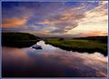
Summer's End — Sunriseby Bear_MusicComment by jenesis: Breathtaking shot! This is one that just makes me say "Wow". Lovely colors, the composition is wonderful and the reflections are amazing. Forgive me for the "only praise" comment but there's just nothing "wrong" about this photo. :-) |
 Photographer found comment helpful. Photographer found comment helpful. |
| 09/09/2005 07:47:37 PM |
|
| Photographer found comment helpful. |
| 09/09/2005 05:49:56 PM |
Summer's End — Sunriseby Bear_MusicComment by Azrifel: Two compositional comments: Horizon might be straight but it feels like it is a bit tilted to the right and the horizon s a bit in the centre of the frame.
However, the way the lines work and how the boat is position compensates a lot for that. Love the color and the light on the grass vs the trees, the sky and the reflection. 9 |
| Photographer found comment helpful. |
| 09/09/2005 01:57:55 PM |
|
| Photographer found comment helpful. |
| 09/09/2005 07:18:38 AM |
|
| Photographer found comment helpful. |
| 09/09/2005 02:40:35 AM |
Summer's End — Sunriseby Bear_MusicComment by Rikki: Bear as always, these images are stunning! You never seem to miss a beautiful sky color. The comp is wonderful as the DOF in this image. I never get tired seeing images such as this. I need to get a 10-22 :) |
| Photographer found comment helpful. |
| 09/08/2005 11:11:00 PM |
|
| Photographer found comment helpful. |
| 09/08/2005 11:07:29 PM |
|
| Photographer found comment helpful. |
| 09/08/2005 04:52:45 PM |
|
| Photographer found comment helpful. |
| 09/08/2005 03:17:54 PM |
Summer's End — Sunriseby Bear_MusicComment by coolhar: love the colors in the sky and the clear reflection but looks a little over-processed to me; overall pretty dark, especially in the lower left; but a very nice image just the same |
| Photographer found comment helpful. |
Home -
Challenges -
Community -
League -
Photos -
Cameras -
Lenses -
Learn -
Help -
Terms of Use -
Privacy -
Top ^
DPChallenge, and website content and design, Copyright © 2001-2026 Challenging Technologies, LLC.
All digital photo copyrights belong to the photographers and may not be used without permission.
Current Server Time: 06/22/2026 03:18:10 PM EDT.